Apple MacBook Pro 13: Can a Mac Be a Decent Windows Laptop?
by Vivek Gowri on October 14, 2010 9:00 PM ESTApple MacBook Pro 13—Conclusion
Apple products tend to be tough to give a conclusion on. There’s the style factor, the (lack of) value factor, the fanboy factor, the OS X factor (for Macs), etc. Macs are divisive products—the people who use them love them, but for every person that loves a Mac there’s two more that wish all things Apple would burn in hell.
So lets start with the easier part of the conclusion: if you need an OS X portable and think the MBP15 is too large, the 13” MacBook Pro is the one to get. It’s $200 more expensive than the plastic unibody MacBook (or $150 if you’re a student, due to a larger discount on the MBP), but it’s definitely worth it, for a number of reasons.The difference in display quality between the plastic MacBook and the MBP13 is almost enough to justify the extra cost alone. The aluminum unibody construction, faster CPU (2.4GHz vs 2.26), RAM upgrade (4GB vs 2GB), backlit keyboard, and SD card reader are just bonuses. It’s thinner, lighter, and has more features, along with a far better display. So unless you’ve got a strict $1000 cap, you’re better off with a MacBook Pro. I have noticed a far larger number of MBP13s than unibody plastic MacBooks lately on the UW campus, so apparently Anand and I aren’t the only ones who feel that way.
More difficult is to compare the MacBook Pro to PC notebooks. Apple products aren’t reknowned for their value for money quotient, but even by Apple standards, this is pretty bad. A Core 2 processor at $1200 and $1500 price points? Even the base MacBook, at around $999, is more than pushing it as far as Core 2 Duo’s go. For comparison, ASUS would be happy to sell you a 14” N82JQ with a quad-core Core i7 and a GT 335M for $900 after their mail in rebate. It’s a bit bigger, but it’s orders of magnitude faster, too. For similarly sized 13.3” notebooks, I’d point you to the U3xJc series—the U30, U33, and U35. 13” notebooks with Core i3 processors, the G 310M/Optimus combo, aluminum or bambo panels, 3.9lbs without an optical drive/4.8lbs with, carrying pricetags of anywhere between $819 and $969. Seriously, these are far less expensive notebooks that perform better and offer more features. The MacBook Pro’s wins in design and screen quality simply aren’t comparable to the ASUS lineups. I’d just like to commend Apple for throwing in a simply superb LCD panel into the MBP, but how much is that worth? How much is the design worth? Can you justify paying $1200 for a computer with two year old internals?
If you’re planning to use it mostly under Windows, I’d come down on the side of no, but if you want to run OS X and just need Windows for some program compatibility issues, then clearly it’s your only option. So again it all comes back to OS X. Apple has created such a finely balanced marriage of their hardware and software that it is almost impossible to have one without the other. So while the MacBook Pro 13’s hardware is beautifully designed and built, it’s almost pointless to use it with anything other than OS X. But if you are hellbent on turning it into a Windows notebook, the MacBook Pro is definitely more than capable of being an excellent PC.


117 Comments
View All Comments
chui101 - Thursday, October 14, 2010 - link
"I wanted to take the vaunted MBP and put it in an apples-to-apples comparison"Shouldn't that be an *Apple*-to apples comparison? :D
numberoneoppa - Thursday, October 14, 2010 - link
o ho - i see what you did there.seanleeforever - Tuesday, October 19, 2010 - link
the article is very well written. However, i would say that comparison section was not well justified.i mean.. look at the price.... if you want to do a "apple to apple" comparison, aren't you suppose to have product in the same ball park? at least for products that carries similar MSRP (i am not even talking about street price, which we all know you can easily get 30% off for all dell).
i know anand review are based on computers that send to you for reviewing at the manufacture's cost, and this chart is probably the best anand can gather. but reading this review is akin to read, say a MB S550 destroies Toyota corolla in term of comfort and features. OKAY.. what i really know is does MB S550 a better vehicle than Lexus LS600. (besdies, the Macbook seems to carry a better screen, but doesn't offer much else if you want to run windows)
i recently discovered you can easily buy a AFFS screen from ebay and swap it yourself. what this means is that instead of buying expensive tablet IPS/AFFS screen, one can just spend 75 dollars on ebay and get a 8 bit AFFS screen for computers such as Thinkpad X200/X201, which will be infinity better than TN of any kind. i am shocked that lenovo doesn't make it a option.
anyhow. good write up, but next time please do a "apple" to "apple" comparison.
newrigel - Saturday, November 27, 2010 - link
Yeah, everyone's a tech.Maxed Out - Thursday, October 14, 2010 - link
I have been running Windows 7 Ultimate from the beta stage and up on my MacBook Pro 17" (Early 2008) and have had no real problems. Before 7 I was running Vista Ultimate x64, so no real surprises. The only real gripe would be that the key (Windows=command & ALT=option) positions and the lack of a contextual menu key, but in the Mac world, right click has been frowned upon by Steve and the rest of the board, so i understand that.The only bad thing I have to say is that, yes the MacBook runs hot in Mac OS, but apple has not done anything to port the ASIC driver that controls the fans, it there for runs even hotter in Windows.
Stokestack - Friday, October 15, 2010 - link
A far bigger annoyance is the lack of a real Delete key. Alone among manufacturers, Apple has only a Backspace key (which they mislabel "delete"). Meanwhile, they have a dedicated Eject key, for seldom-used optical media. Oh, and they decided that they had to put a hardware delay on Eject, to prevent the bloody mayhem of accidentally ejecting a disc. That prevents you from remapping it as a Delete key.Apple could easily have solved both problems by replacing Eject with a real Delete key, and making Eject a secondary function on some other key (or even on the same one). Instead, they require you to use a secret two-handed key combination to delete a character. The vast majority of users spend their time arrowing to the right across the text they want to delete and then backspacing over it. Yes, that's "elegant."
The reviewer also should have hammered the asinine glossy screen, and lack of a matte option. It makes no sense: The computer most likely to actually leave the house is the one denied common-sense options like a matte screen. Glossy screens suck in all conditions; even in a pitch-black room, you see YOURSELF in the screen because you're illuminated by it. Those "deep blacks" and "rich colors" you were promised with a glossy screen are neither deep nor rich when washed out by the sheen of reflection that covers them 100% of the time.
JS - Friday, October 15, 2010 - link
I definitely prefer glossy screens on desktops. To me, seeing a vague reflection of yourself under certain lighting conditions is nothing compared to the "sparkling" surface finish of all matte screens that I have used so far.It's a matter of taste.
SoCalBoomer - Friday, October 15, 2010 - link
That would be fine - if he were reviewing a desktop. He's reviewing a laptop and on a laptop, a glossy screen is asinine! :DTros - Friday, October 15, 2010 - link
I'm using both a matte desktop screen (Samsung P2570HD) and a MBP side by side right now. Guess what. I can read things easier on the glossy high-contrast screen better than on the matte-monitor. The blacks are deeper, the whites are brighter. I can also read on the MBP outside (Texas).I would like to think that this isn't because of glossy vs matte, but because of contrast, period. I have another laptop around here with a glossy screen, and have a hard time reading it in a lit room.
B3an - Friday, October 15, 2010 - link
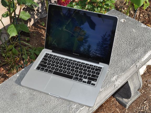
High contrast will make a screen easier to read and whatever, but if that MBP had a matte screen it would be yet more easy to see with no distractions. The whole point of a display is to see what's displayed on it, not to see what's reflected on it, which is also going to affect colour accuracy. Glossy screens are totally not usable as far as i'm concerned.Even in the pics posted here it looks ridiculous, imagine how much better and easier to see that screen would be outside without all them reflections over it.