The Razer Blade Review
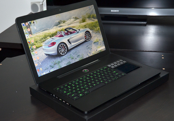
by Vivek Gowri & Jarred Walton on March 15, 2012 3:01 AM ESTThere is something absolutely arresting about the Blade’s overall aesthetic. It’s big, but so strikingly thin at the same time, and the matte black paintjob is like a visual black hole. The overall effect is eye-catching, breathtaking, and will cause random passerby to stop and ask questions.
The design language is really, really clean and rather understated, two things you don’t expect from most gaming notebooks, while still keeping a sense of flair about it. The lid has two ribs vertically arranged on either side of the glowing Razer logo on the back, breaking up the monotony of the otherwise flat profile of the lid. Everything here is very uniformly laid out—lots of rectangles with radiused edges, no extraneous design elements, but unlike Apple’s portables, there’s no feeling of overwhelming sterility. Apple has taken the minimalist design philosophy so far that the MacBook Pro design language feels almost soulless.
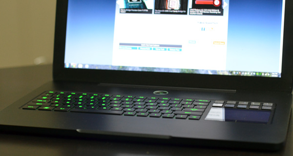
The Blade doesn’t have that problem. The flat black aesthetic is offset by green accents—lots of them. The Razer logo on the back lights up in green, the power button has a Razer logo that glows green and pulsates almost like a heartbeat, the USB 3.0 port is green, the keys on the keyboard are green, a lot of the UI elements of the Switchlade panel are green, the list goes on. The industrial design is very clean, but what’s impressive is the overall polish in the design and how the whole thing ties together. It’s the little things—the attention to detail borders on obsessive, and that’s very good to see.
No matter what you think about the specs or the price, it’s impossible to ignore the fact that the Blade is a gorgeous, gorgeous device. It’s very obviously built to a high standard of build quality, with a machined aluminum unibody chassis that, even being so thin, is very structurally rigid. The lid and hinge are also pretty sturdy feeling, and the keyboard has no flex. Nothing about the look and feel of the Blade suggests anything less than a truly premium product.
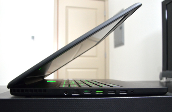
In terms of ports, the Blade is pretty sparse. There’s one USB 3.0, two USB 2.0, HDMI, gigabit Ethernet, combo headphone jack/line in, and AC power all on the left side of the machine, as well as a Kensington lock on the right side. I’d definitely have liked to see an SD card slot here, along with one more USB 3.0 port, but given the form factor, you can understand why the Blade doesn’t have too much in the way of ports. The reason almost all the ports are on the left side is so that when at a desk using a mouse, gamers won’t ever run into the peripheral devices connected. Close to the back of the unit, there’s vents on either side; GPU on the right, CPU on the left.
The front is also completely clean, other than the angled cutout for opening the latch-less screen. The back of the system is dominated by the hinge, a right-angled piece that borrows from Apple’s playbook for designing low-profile hinges. The bottom of the system is also pretty minimalist, with chrome-ringed heat vents on the right and left sides, FCC information silk screened onto the body, and the Windows COA sticker. The heat vents are nice in that they are angled such that they blow air towards the rear of the notebook, away from the user.
The LCD bezel is thicker than I’d like, but the larger footprint was probably necessitated by the super-thin form factor. Above the display, we find the 2.0MP webcam, mic, and light sensor, while below it we find the highly stylised Blade logo rendered in glossy black. Against the metallic matte black of the rest of the interior, it’s understated yet incredibly cool looking.
The rest of the interior is pretty interesting. First things first, there’s no touchpad in the conventional sense—what happened, effectively, is that the touch-based input device got moved to where the keyboard’s number pad would be, leaving the area underneath the keyboard completely free. The keyboard and Switchblade are important enough to deserve their own page, but the rearranging of the touchpad enabled Razer to do some interesting things with the design. There’s much more space above the keyboard than you’d typically find on a notebook, something that Razer took advantage of by piping most of the heat generated by the CPU and GPU to that area. It’s not somewhere where people typically touch their computers, unlike the bottom or the palmrests, so engineering the thermal system to move heat towards the rear left corner was a good idea. Razer put vents on both sides of the Blade, but a majority of the heat is exhausted from the one on the left because the design team didn’t want hot air blowing on the mouse hand (when using an external mouse). It’s touches like this that impress—it’s rare to find this kind of polish or attention to detail in a company’s first computer.


95 Comments
View All Comments
1ceTr0n - Thursday, March 15, 2012 - link
but then I took a reality check arrow in the walletnathanddrews - Thursday, March 15, 2012 - link
Great review. Finally, a gaming notebook that looks like it was designed by adults.I have to say that I find the use a 1080p panel on a notebook (especially a gaming notebook) without the power to feed it as a wasted expense - no matter how beautiful it may be. Is there an option for a similarly gorgeous 1600x900 display instead?
Snotling - Thursday, March 15, 2012 - link
Seriously? have you ever looked at a 17" 1080p panel? it's the minimum acceptable resolution. below that you're in smartphone territory.Flunk - Thursday, March 15, 2012 - link
The pixel density on high end smartphones horribly destroys even the most high end notebooks. The Galaxy Nexus has a 720 x 1280 (720p) screen that's 4.65" across. There isn't any competition there. 316 ppi vs 127 on the notebook.aleyon - Monday, March 19, 2012 - link
the gnexus has a pentile display, which, aside from sucking, doesn't possess quite as many real pixels as specified.you probably hate apple, but a truly high pixel density is the realm of the 4/4S/new iPad.
DareDevil01 - Monday, April 23, 2012 - link
You seem to be forgetting The HTC Rezound & Sony Xperia S which both have 720p screens and are below 4.3"Excerpt from Xpereia Swiki page:
"The capacitive touchscreen display measures 4.3 inches with a resolution of 1280 x 720 and at 342 ppi, is tied with the HTC Rezound for the highest pixel density in any mobile phone released."
Spunjji - Friday, July 13, 2012 - link
No no no no no. Apple invented high resolution displays! Especially on laptops. Silly person! ;)Special people are special.
b3nzint - Thursday, March 22, 2012 - link
yes, but if they use that high density into 14' that would increase the price way high, just dont sells!drew_afx - Thursday, March 15, 2012 - link
well, i'm not sure if you thought about gaming on that laptop..all those high end games that will come out soon is gonna take
more than GT555M, especially at 1080p
you need enthusiast level of graphics to run 1080p smoothly on a laptop.
CPU's definitely not the bottleneck, but the thermal requirement for
that thin laptop is keeping Razer from using power sucking gpus
santiagodraco - Sunday, March 18, 2012 - link
Adults that don't understand what gamers really want, performance first.Sure it looks great and has lot's of glitz and glamor, but I'll take my much better performing M17x R3 thank you very much.
Now if Razer can figure out who to put proper performance hardware into that thin a package and keep it cool then I'll be impressed. Well at about 900 bucks less along with it.