Samsung Galaxy Tab Pro 8.4 and 10.1 Review
by Jarred Walton on March 22, 2014 9:30 PM ESTSamsung Galaxy Pro Software
We’ve discussed TouchWiz UI extensively in the past, so I’m not going to rehash that here. Some people like it, others like me are mostly ambivalent, and still others seem to really dislike it. Besides the enhancement to the UI, Samsung has some other additions. Let’s quickly cover some of these here.
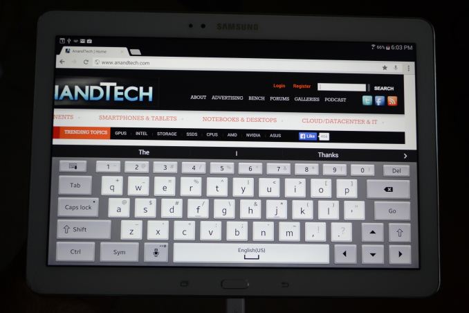
One of the biggest changes for me is the keyboard, and this is one of those items that I’m actually very happy using. I don’t like typing a lot on tablets, but Samsung’s addition of a dedicated row of number keys – basically emulating a regular keyboard – makes it that much less painful to do certain tasks (like entering passwords with numbers, letters, and symbols). The first time it appeared, I was a little confused as the keyboard looked quite a bit different than what I’m used to seeing, but after that initial surprise I found myself liking the keyboard more and more. Some people prefer Swype, or the regular Android keyboard, and that’s fine – if you know enough to prefer a different keyboard, you can always install one. The Samsung keyboard does support swiping as well as audio feedback; the Pro 10.1 also offers haptic feedback (vibration) on keyboard input, but I didn’t find that necessary.
Interestingly, since I just discussed the keyboard aspect, Samsung has their own custom gesture to capture a screenshot – the standard “Volume Up + Power” shortcut doesn’t work. To capture a screen, you swipe the side of your palm left to right or right to left across the screen. The only problem? It doesn’t always work properly, or at least I don’t think it works if the keyboard is active, hence the above photos of the keyboard rather than screen grabs. Personally, I’d prefer something less obtuse or difficult – how about just a long press of the task switcher or back button to take a screen shot? But I digress….
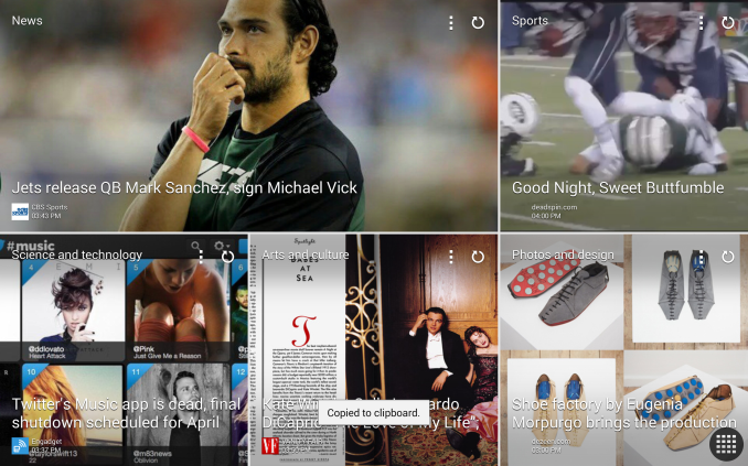
Moving on in the software coverage, probably the biggest addition here is the new Magazine UX. I wasn’t sure about it at first, but man you could waste a lot of time in there. There are tiles for News, Sports, Science and Technology, Arts and Culture, Photos and Design, Business, New and Noteworthy, and Style – and that’s it; you can’t add more than those eight categories, but you can disable some of them. You can also customize what each of those panes shows with all sorts of additional feeds (no, AnandTech isn’t in the Science and Technology section – boo!), and once enabled all you have to do is click on the tile to be presented with a “magazine”. Technically all of this appears to be using a piece of software called Flipboard, and Magazine UX is just the integration into the home screens of Android as far as I can tell – task switcher even labels the app as “Flipboard”. The biggest gripe people are going to have with Magazine UX is that it can’t be disabled – you will always have at least one Magazine UX screen in addition to the home screen (and you can make Magazine UX into your default screen if you prefer); end of discussion.
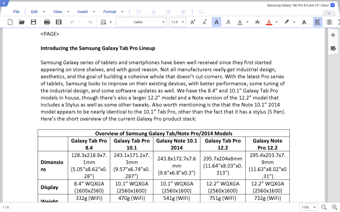
Another additional piece of software is Hancom Office, which allows you to run the typical office applications. You get a word processor, spreadsheet, presentations program (Hword, Hcell, and Hshow), and yes, they can open MS Office files – or at least the Office 2010 files I tried worked okay. Editing office files on a tablet isn’t something I’ve really tried to do, but even the ability to view them can be very useful. There are other free office apps out there, but Hancom looks fine from what I can see, and it’s normally a $17.77 purchase. You do need to create a Samsung account to access Hancom, apparently, but that was easy enough to do.
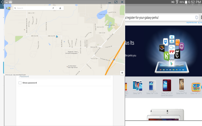
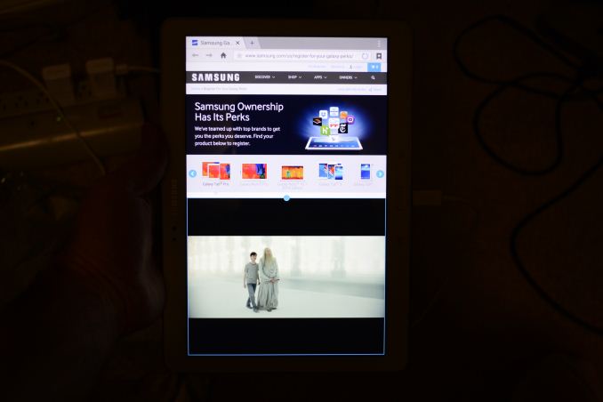
There’s at least one truly interesting feature with the latest TouchWiz UI on the Galaxy Pro line of tablets that is perhaps a sign of things to come. While Microsoft is busily moving us more towards a one screen, one app world with their Modern UI (okay, with the ability to do split-screen as well), Samsung has added multi-window mode on the Galaxy Pro tablets. It’s a bit raw right now, and it only supports certain applications, but you can actually have three (on the 8.4 and 10.1) or four windows (on the 12.2) open and resized at once. The window contents basically end up being stretched to fit, however, so you can get some weird warping if you don’t maintain the aspect ratio. When you minimize a window, it becomes a circular button that you can move around, and click on it to restore it to an active window.
An alternative that proves a bit more useful is the split-screen mode. Apparently the 12.2 can support four tiled apps (restricted to the support apps list), while the 8.4 and 10.1 only support split-screen, but you could open a browser in the bottom window and a video in the top, or two browsers, or some other combination. I tested the multi-window and split-screen modes with the web browser, video player, office, gallery, and Hang Outs (not all at once). It all worked as advertised, but there’s a limited amount of resizing available and clearly most apps aren’t really designed for this sort of operation. Maybe in a future version of Android we’ll see additional multi-tasking/multi-windowing features, but Samsung is at least playing around with the idea right now.
There are two more pieces of software that I didn’t have a chance to try out yet, E-Meeting and Remote PC. E-Meeting allows you to share a file (or files?) locally, with everyone on the same WiFi network. They can then join the meeting and see your presentation, spreadsheet, pictures, etc. on their own tablet. It’s basically the inverse of a projector, where instead of everyone seeing one screen you’re all given individual screen to look at. There’s also an integrated White Board for people to use for notes and such. Remote PC is a way to remotely access your Windows or OS X PC via your Samsung Pro tablet, through your Samsung account. You can copy files from your PC to your tablet (and I’d assume the reverse as well), or just remotely control your PC via the tablet. I’m not sure if Samsung is working with a third party (i.e. LogMeIn or Teamviewer), but similar functionality is available on Android devices in general with the right software.
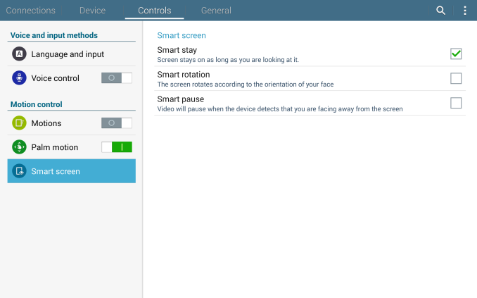
There are plenty of other items I could discuss with the software and features, but let’s just wrap this up for now with one last feature: Smart screen (as I don’t think we’ve covered this previously). Smart screen uses the front-facing camera with face/eye recognition and has three settings available. “Smart stay” will keep the display from going to sleep as long as you are looking at the tablet; “Smart rotation” will rotate the tablet based on the orientation of your face; lastly, “Smart pause” will pause video playback if you look away from the tablet and resume when you start watching again. While some of this may be novel/useful, I have a couple problems with Smart screen.
First, it requires a decent amount of ambient light, so if you’re watching a movie on the tablet in the dark, Smart pause won’t work and I’m not sure if Smart stay works either. In proper lighting, I can confirm that they both appear to work, but Smart pause can still be a bit touchy – it pauses quite quickly if you look away from the screen (and sometimes even if you don’t but just shift position) – almost too quickly I’d say – but it’s slower at resuming. The second problem is that I never could get the Smart rotation to work, no matter how hard I tried – it would only rotate if I picked up the tablet and then the normal gravity-based sensors would do what I needed. So basically, other than potentially Smart stay, the feature is of questionable utility. I’m also not sure how much extra power drain enabling Smart screen would entail – it would have to do something to look for your face, and even if it’s only a 2% reduction in battery life, that could mean another 15+ minutes.
Overall, the software package that Samsung delivers with the Galaxy Pro does offer some useful and interesting features. It would be nice if users could disable Magazine UX entirely, for those that don’t want it, but considering tablets are often use as media consumption devices there’s a lot of curated content available with minimal effort on the part of the user, and that’s pretty cool to see. I probably wasted (used) at least an hour or two just poking around at news stories from around the Web when I was “testing” Magazine UX. And even after more than a week with the Galaxy Pro, there are plenty of things I haven’t really had the time to fully investigate (or write about). If you’re in the camp with those that think Android should be a unified experience across all devices, Samsung will probably frustrate you, but as someone who has used over a dozen Android tablets over the past few years, my feeling is that there really isn’t a need for perfect uniformity – the flexibility Android provides OEMs is one of its advantages over iOS. If you don’t like one particular tablet, there are plenty of others to choose from!


_thumb.png)
_thumb.png)
_thumb.png)
_thumb.png)
_thumb.png)
_thumb.png)


125 Comments
View All Comments
SilthDraeth - Saturday, March 22, 2014 - link
On my note phone if I want to take a screenshot, I hold the power button and the Samsung Home button. Give that a try. Or, on my wife's note 10.1 first edition, it has a dedicated screenshot softkey that appears where your normal android home keys, etc appear.FwFred - Sunday, March 23, 2014 - link
LOL... 'Pro'. Surface Pro 2 just fell off the chair laughing.garret_merrill - Friday, October 3, 2014 - link
Really good tablets, although I would seriously consider the Note Pro series too (highly ranked by a number of sources, see http://www.consumertop.com/best-tablets/). But either way, the Samsung tables deliver fantastic quality.Brian Z - Saturday, March 22, 2014 - link
Antutu? Really... Maybe somebody kidnapped Anand and Brian. Frigging Antutugrahaman27 - Saturday, March 22, 2014 - link
Better than just posting the browser speed tests for CPU, and draw final thoughts from that, which they have gotten in a habit of doing.JarredWalton - Sunday, March 23, 2014 - link
What's wrong with running one more benchmark and listing results for it? Sheesh... most of the time people complain about not having enough data, and now someone is upset for me running AnTuTu. Yes, I know companies have "cheated" on it in the past, but the latest revision seems about as valid in its reported scores as any of the other benchmarks. Now if it wouldn't crash half the time, that would be great. :-\Egg - Sunday, March 23, 2014 - link
You do realize that Brian has, for all intents and purposes, publicly cursed AnTuTu and mocked the journalists who used it?JarredWalton - Sunday, March 23, 2014 - link
The big problem is people that *only* (or primarily) use AnTuTu and rely on it as a major source of performance data. I'm not comparing AnTuTu scores with tons of devices; what I've done is provide Samsung Galaxy Tab Pro 8.4 vs. 10.1 scores, mostly to show what happens when the CPU in the 10.1 hits 1.8-1.9 GHz. It's not "cheating" to do that either -- it's just that the JavaScript tests mostly don't go above 1.2-1.3GHz for whatever reason. Octane and many other benchmarks hit higher clocks, but Sunspider and Kraken specifically do not. It's probably an architectural+governor thing, where the active threads bounce around the cores of the Exynos enough that they don't trigger higher clocks.Don't worry -- we're not suddenly changing stances on Geekbench, AnTuTu, etc. but given the odd clocks I was seeing with the 10.1 I wanted to check a few more data points. Hopefully that clarifies things? It was Brian after all that used AnTuTu to test for cheating (among other things).
Wilco1 - Sunday, March 23, 2014 - link
The reason for the CPU clock staying low is because the subtests in Sunspider and AnTuTu only take a few milliseconds (Anand showed this in graphs a while back). That means there is not enough time to boost the frequency to the maximum (this takes some time). Longer running benchmarks like Geekbench are fine. I wouldn't be surprised if the governor will soon start to recognize these microbenchmarks by their repeated bursty behaviour rather than by their name...Of course the AnTuTu and Javascript benchmarks suffer from many other issues, such as not using geomean to calculate the average (making it easy to cheat by speeding up just one subtest) and using tiny unrepresentative micro benchmarks far simpler than even Dhrystone.
Also it would be nice to see a bit more detail about the first fully working big/little octa core with GTS enabled. Previously AnandTech has been quite negative about the power consumption of Cortex-A15, and now it looks the 5420 beats Krait on power efficiency while having identical performance...
virtual void - Monday, March 24, 2014 - link
You cannot disregard the result produced by something just because the load generated by the benchmark comes in very short burst, that is the _typical_ workload faced by these kind of devices.The result in Geekbench give you some hint how the device would handle HPC-workloads, it give you very limited information about how well it handles mobile apps. Another problem with Geekbench is that it runs almost entirely out of L1$. 97% of the memory accesses where reported as L1-hits on a Sandy Bridge CPU (32kB L1D$). Not even mobile apps has such a small working set.
big.LITTLE is always at a disadvantage vs one single core in bursty workloads as the frequency transition latency is relatively high when switching CPU-cores. Low P-state switching time probably explains why BayTrail "feels" a lot faster than what the benchmarks like Geekbench suggest. BayTrail has a P-state latency of 10µs while ARM SoCs (without big.LITTLE) seem to lie between 0.1ms - 1ms (according to the Linux device-tree information).