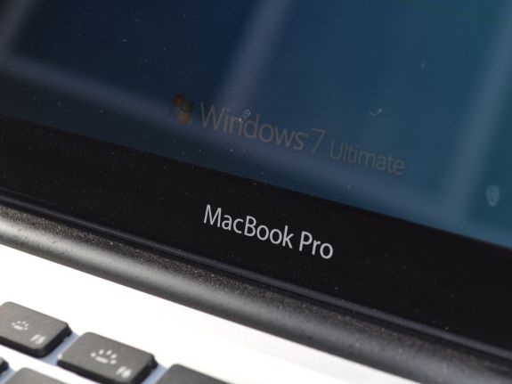
Apple MacBook Pro 13: Can a Mac Be a Decent Windows Laptop?
by Vivek Gowri on October 14, 2010 9:00 PM ESTApple MacBook Pro 13—Some Quirks as a PC
Yes, there are quirks, but not as many as one might suspect. For the most part, the MacBook Pro functions as any PC notebook would, though with some of Apple’s features present. To smooth out the transition between the designed-for-OS X hardware and the Windows system, Apple has included a Boot Camp utility to customize settings with the mouse, keyboard, and which operating system the notebook should boot on the next restart.
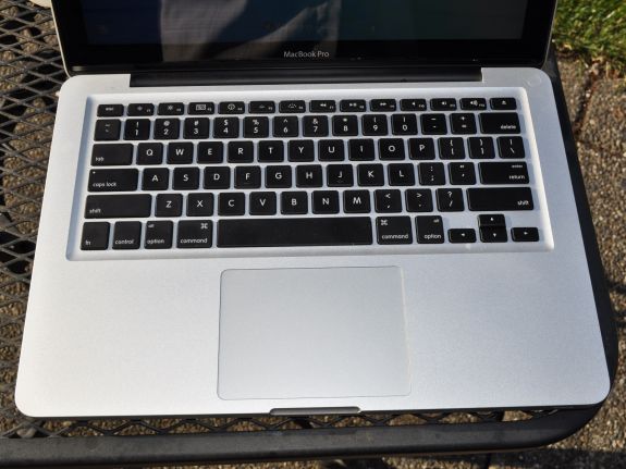
The keyboard settings are pretty sparse; you can choose between having the F-keys default to F1, F2, F3 etc., or default to the brightness and volume changing utilities, with a press of the function key to use the standard F-keys. The trackpad settings are more interesting: you have two finger right click, two finger scroll, and various options to lock the touchpad in drag mode (it’s hard to describe, but makes sense instantly when you use it). The best part is turning the bottom right-hand corner of the touchpad into a right click button. Tap anywhere else, you get a left click; tap at the bottom right (where you’d expect the right click button to be on a PC notebook) and it’ll give you a right click. It’s pretty brilliant, and rectifies one of the chief complaints with running the older MacBooks and MacBook Pros under Windows, where it was necessary to Ctrl+tap to get a right click.
Overall what struck me was how cohesive the experience was in Windows. Everything translates over pretty well—Apple has coded in the same popup animations for the hardware control shortcuts (volume, brightness, etc) for Windows, and the two finger scroll is simply the best in the business. I don’t know how or why, but two finger scroll on the MacBook Pro just works better than two finger scroll on normal Synaptics touchpads, and the entire touchpad just works. It amazes me that basically nobody else has figured out how to do a buttonless/single button touchpad yet (Dell, HP?), but Apple’s is pretty great, especially with the new right click corner. Maybe it's just the size of the touchpad—bigger is better?
The keyboard wasn’t as easy to adjust to though. I go through a lot of laptops, so I’ve gotten pretty adept at switching between various layouts, but for some reason the MBP threw me more than most. I don’t remember having trouble adjusting to any of the previous two dozen-odd notebooks I’ve had in the last few months, so it was definitely different. I’m not entirely sure why, probably just a combination of things. Apple likes to switch the control and function keys, Lenovo-style, and I think I got used to the OS X shortcuts on the Apple keyboard (which is odd because I never actually used OS X on this system beyond running the Boot Camp partition utility the first time). Unfortunately, Apple+C and Apple+V aren’t copy and paste in Windows.
But other than that and the occasional annoyance at having to use the function key to get some keys (Fn+Bkspace to get Delete, Fn+Up/Down for page up and down), the keyboard was as awesome as it always has been. As I said before, it’s the best chiclet keyboard out there, even better than the ThinkPad chiclet keyboard. It just underscores this point: everything that makes the MacBook Pro a great notebook in OS X still makes it a great notebook under Windows, with a couple of quirks along the way to give it character.


117 Comments
View All Comments
chui101 - Thursday, October 14, 2010 - link
"I wanted to take the vaunted MBP and put it in an apples-to-apples comparison"Shouldn't that be an *Apple*-to apples comparison? :D
numberoneoppa - Thursday, October 14, 2010 - link
o ho - i see what you did there.seanleeforever - Tuesday, October 19, 2010 - link
the article is very well written. However, i would say that comparison section was not well justified.i mean.. look at the price.... if you want to do a "apple to apple" comparison, aren't you suppose to have product in the same ball park? at least for products that carries similar MSRP (i am not even talking about street price, which we all know you can easily get 30% off for all dell).
i know anand review are based on computers that send to you for reviewing at the manufacture's cost, and this chart is probably the best anand can gather. but reading this review is akin to read, say a MB S550 destroies Toyota corolla in term of comfort and features. OKAY.. what i really know is does MB S550 a better vehicle than Lexus LS600. (besdies, the Macbook seems to carry a better screen, but doesn't offer much else if you want to run windows)
i recently discovered you can easily buy a AFFS screen from ebay and swap it yourself. what this means is that instead of buying expensive tablet IPS/AFFS screen, one can just spend 75 dollars on ebay and get a 8 bit AFFS screen for computers such as Thinkpad X200/X201, which will be infinity better than TN of any kind. i am shocked that lenovo doesn't make it a option.
anyhow. good write up, but next time please do a "apple" to "apple" comparison.
newrigel - Saturday, November 27, 2010 - link
Yeah, everyone's a tech.Maxed Out - Thursday, October 14, 2010 - link
I have been running Windows 7 Ultimate from the beta stage and up on my MacBook Pro 17" (Early 2008) and have had no real problems. Before 7 I was running Vista Ultimate x64, so no real surprises. The only real gripe would be that the key (Windows=command & ALT=option) positions and the lack of a contextual menu key, but in the Mac world, right click has been frowned upon by Steve and the rest of the board, so i understand that.The only bad thing I have to say is that, yes the MacBook runs hot in Mac OS, but apple has not done anything to port the ASIC driver that controls the fans, it there for runs even hotter in Windows.
Stokestack - Friday, October 15, 2010 - link
A far bigger annoyance is the lack of a real Delete key. Alone among manufacturers, Apple has only a Backspace key (which they mislabel "delete"). Meanwhile, they have a dedicated Eject key, for seldom-used optical media. Oh, and they decided that they had to put a hardware delay on Eject, to prevent the bloody mayhem of accidentally ejecting a disc. That prevents you from remapping it as a Delete key.Apple could easily have solved both problems by replacing Eject with a real Delete key, and making Eject a secondary function on some other key (or even on the same one). Instead, they require you to use a secret two-handed key combination to delete a character. The vast majority of users spend their time arrowing to the right across the text they want to delete and then backspacing over it. Yes, that's "elegant."
The reviewer also should have hammered the asinine glossy screen, and lack of a matte option. It makes no sense: The computer most likely to actually leave the house is the one denied common-sense options like a matte screen. Glossy screens suck in all conditions; even in a pitch-black room, you see YOURSELF in the screen because you're illuminated by it. Those "deep blacks" and "rich colors" you were promised with a glossy screen are neither deep nor rich when washed out by the sheen of reflection that covers them 100% of the time.
JS - Friday, October 15, 2010 - link
I definitely prefer glossy screens on desktops. To me, seeing a vague reflection of yourself under certain lighting conditions is nothing compared to the "sparkling" surface finish of all matte screens that I have used so far.It's a matter of taste.
SoCalBoomer - Friday, October 15, 2010 - link
That would be fine - if he were reviewing a desktop. He's reviewing a laptop and on a laptop, a glossy screen is asinine! :DTros - Friday, October 15, 2010 - link
I'm using both a matte desktop screen (Samsung P2570HD) and a MBP side by side right now. Guess what. I can read things easier on the glossy high-contrast screen better than on the matte-monitor. The blacks are deeper, the whites are brighter. I can also read on the MBP outside (Texas).I would like to think that this isn't because of glossy vs matte, but because of contrast, period. I have another laptop around here with a glossy screen, and have a hard time reading it in a lit room.
B3an - Friday, October 15, 2010 - link
High contrast will make a screen easier to read and whatever, but if that MBP had a matte screen it would be yet more easy to see with no distractions. The whole point of a display is to see what's displayed on it, not to see what's reflected on it, which is also going to affect colour accuracy. Glossy screens are totally not usable as far as i'm concerned.Even in the pics posted here it looks ridiculous, imagine how much better and easier to see that screen would be outside without all them reflections over it.