Apple MacBook Pro 13: Can a Mac Be a Decent Windows Laptop?
by Vivek Gowri on October 14, 2010 9:00 PM ESTApple MacBook Pro 13—Awesome Display
Oh man, where do I start? Compared to most PC notebooks, especially thin and lights, this display is simply superb. Apple uses a very high quality, high contrast panel in the MacBook Pro, and it’s one of the most noticeable advantages the MPB has over the PC notebook world. It just adds to the high quality feeling that the MBP practically exudes—it’s like Apple thought of everything to make it more enjoyable to use. I really wish other manufacturers would put in the money and effort into speccing their systems with high quality displays.
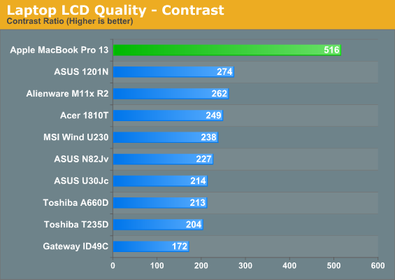
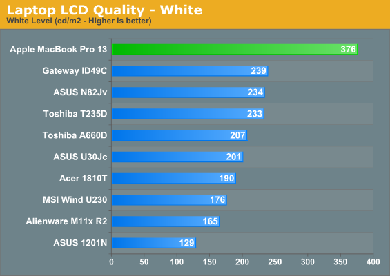
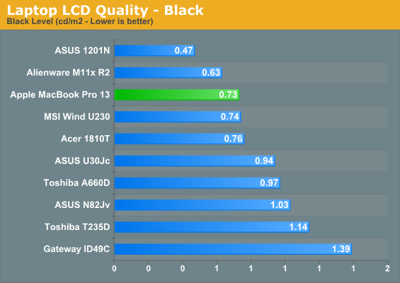
The contrast ratio of 516:1 is chart topping, even higher than the excellent RGB-LED backlit screen in the Dell SXPS 16. It’s orders of magnitude better than basically any other thin and light or ultraportable notebook we’ve tested recently. Think about the same maximum white level as the Adamo, but with the black levels of something with half the brightness. I officially love this screen, even with all the super glossy stuff going around. (For the record, I still hate Apple for not offering the MacBook Pro 13” with a matte screen, but they could always make me happy and offer it as an option on the Sandy Bridge variant. I’m not holding my breath, though.)
There are of course other LCDs that can achieve higher contrast ratios, like the RGB LED panels in Dell's Precision M6500, HP's DreamColor offerings (i.e. EliteBook 8740w), and perhaps a few others. We've also seen plenty of decent panels in larger notebooks like the ASUS G73Jh, Clevo X7200, MSI GX640, etc. The problem is, few if any thin and light laptops have decent contrast, and those that do it with a 360nit maximum brightness are even harder to find. Also note that the MBP13 Anand tested under OS X scored even better than the results from this Win7 unit, but that may simply be variation among panels. The difference between 600:1 and 500:1 isn't all that striking; usually you need at least 50% more contrast before it becomes noticeable, and once you reach 1000:1 the only change is typically in fractionally darker blacks.
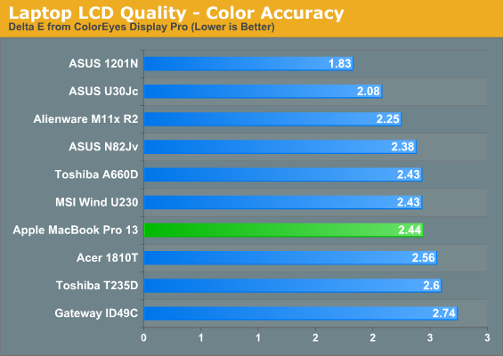
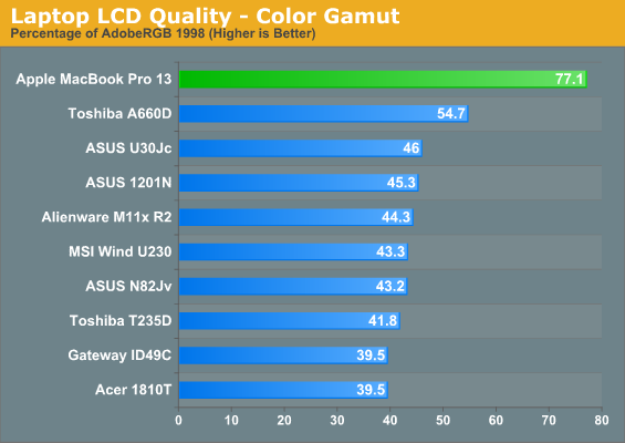
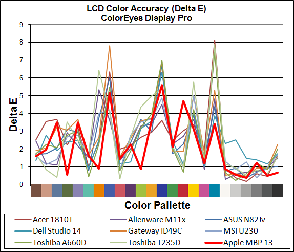
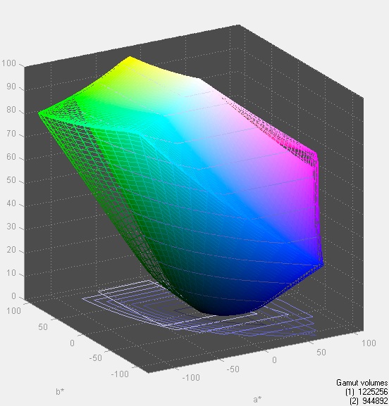
Color accuracy is pretty good, as is the color gamut. In fact, the MBP has one of the best color gamuts we’ve seen on a 13” notebook. But here’s the takeaway from all this: the MacBook Pro is one of the only small notebooks with a decent display. I’m not going to say it’s the only one, since I haven’t tested all of them (and the Sony Z still exists), but of all the notebooks we’ve been through, it’s by far the best one. I really wish more PC manufacturers would “get it” and spec their notebooks with higher quality displays, or at least offer a better screen as an option.


117 Comments
View All Comments
chui101 - Thursday, October 14, 2010 - link
"I wanted to take the vaunted MBP and put it in an apples-to-apples comparison"Shouldn't that be an *Apple*-to apples comparison? :D
numberoneoppa - Thursday, October 14, 2010 - link
o ho - i see what you did there.seanleeforever - Tuesday, October 19, 2010 - link
the article is very well written. However, i would say that comparison section was not well justified.i mean.. look at the price.... if you want to do a "apple to apple" comparison, aren't you suppose to have product in the same ball park? at least for products that carries similar MSRP (i am not even talking about street price, which we all know you can easily get 30% off for all dell).
i know anand review are based on computers that send to you for reviewing at the manufacture's cost, and this chart is probably the best anand can gather. but reading this review is akin to read, say a MB S550 destroies Toyota corolla in term of comfort and features. OKAY.. what i really know is does MB S550 a better vehicle than Lexus LS600. (besdies, the Macbook seems to carry a better screen, but doesn't offer much else if you want to run windows)
i recently discovered you can easily buy a AFFS screen from ebay and swap it yourself. what this means is that instead of buying expensive tablet IPS/AFFS screen, one can just spend 75 dollars on ebay and get a 8 bit AFFS screen for computers such as Thinkpad X200/X201, which will be infinity better than TN of any kind. i am shocked that lenovo doesn't make it a option.
anyhow. good write up, but next time please do a "apple" to "apple" comparison.
newrigel - Saturday, November 27, 2010 - link
Yeah, everyone's a tech.Maxed Out - Thursday, October 14, 2010 - link
I have been running Windows 7 Ultimate from the beta stage and up on my MacBook Pro 17" (Early 2008) and have had no real problems. Before 7 I was running Vista Ultimate x64, so no real surprises. The only real gripe would be that the key (Windows=command & ALT=option) positions and the lack of a contextual menu key, but in the Mac world, right click has been frowned upon by Steve and the rest of the board, so i understand that.The only bad thing I have to say is that, yes the MacBook runs hot in Mac OS, but apple has not done anything to port the ASIC driver that controls the fans, it there for runs even hotter in Windows.
Stokestack - Friday, October 15, 2010 - link
A far bigger annoyance is the lack of a real Delete key. Alone among manufacturers, Apple has only a Backspace key (which they mislabel "delete"). Meanwhile, they have a dedicated Eject key, for seldom-used optical media. Oh, and they decided that they had to put a hardware delay on Eject, to prevent the bloody mayhem of accidentally ejecting a disc. That prevents you from remapping it as a Delete key.Apple could easily have solved both problems by replacing Eject with a real Delete key, and making Eject a secondary function on some other key (or even on the same one). Instead, they require you to use a secret two-handed key combination to delete a character. The vast majority of users spend their time arrowing to the right across the text they want to delete and then backspacing over it. Yes, that's "elegant."
The reviewer also should have hammered the asinine glossy screen, and lack of a matte option. It makes no sense: The computer most likely to actually leave the house is the one denied common-sense options like a matte screen. Glossy screens suck in all conditions; even in a pitch-black room, you see YOURSELF in the screen because you're illuminated by it. Those "deep blacks" and "rich colors" you were promised with a glossy screen are neither deep nor rich when washed out by the sheen of reflection that covers them 100% of the time.
JS - Friday, October 15, 2010 - link
I definitely prefer glossy screens on desktops. To me, seeing a vague reflection of yourself under certain lighting conditions is nothing compared to the "sparkling" surface finish of all matte screens that I have used so far.It's a matter of taste.
SoCalBoomer - Friday, October 15, 2010 - link
That would be fine - if he were reviewing a desktop. He's reviewing a laptop and on a laptop, a glossy screen is asinine! :DTros - Friday, October 15, 2010 - link
I'm using both a matte desktop screen (Samsung P2570HD) and a MBP side by side right now. Guess what. I can read things easier on the glossy high-contrast screen better than on the matte-monitor. The blacks are deeper, the whites are brighter. I can also read on the MBP outside (Texas).I would like to think that this isn't because of glossy vs matte, but because of contrast, period. I have another laptop around here with a glossy screen, and have a hard time reading it in a lit room.
B3an - Friday, October 15, 2010 - link
High contrast will make a screen easier to read and whatever, but if that MBP had a matte screen it would be yet more easy to see with no distractions. The whole point of a display is to see what's displayed on it, not to see what's reflected on it, which is also going to affect colour accuracy. Glossy screens are totally not usable as far as i'm concerned.Even in the pics posted here it looks ridiculous, imagine how much better and easier to see that screen would be outside without all them reflections over it.