13-inch Retina MacBook Pro Review (Late 2012)
by Anand Lal Shimpi on November 13, 2012 2:53 AM ESTEarlier this year Apple introduced its first Mac equipped with a Retina Display. The 15.4-inch MacBook Pro with Retina Display (henceforth rMBP) introduced a brand new, thinner and lighter chassis to the MacBook family while serving as the launch vehicle for the world's first 2880 x 1800 notebook display.
Although the 15-inch rMBP was significantly more portable than its predecessor, the number one question asked after its release was when the MacBook Air would get similar Retina Display treatment. As the first Mac with an ultra high resolution IPS panel, the value of the 15-inch rMBP was obvious, but these days the market demands extreme portability.
Over the past few years, the 13-inch notebook form factor emerged as a great balance between functional size and portability. Although many hoped for a MacBook Air equipped with a Retina Display, for the follow on to the 15-inch rMBP Apple made the logical progression and brought a Retina Display to its 13-inch MacBook Pro.
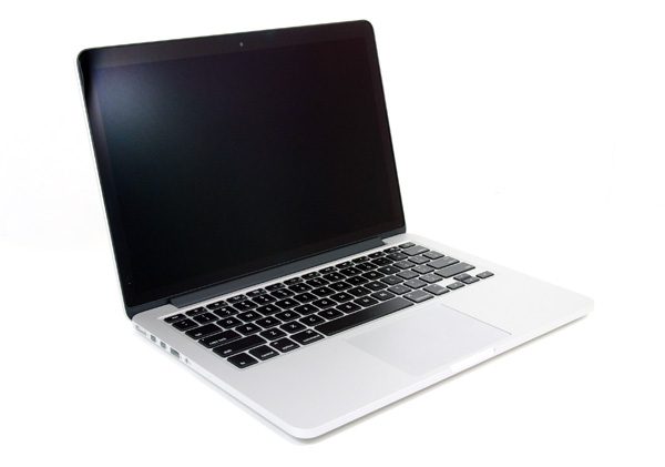
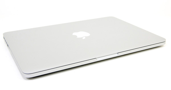
In doing so, the 13-inch MacBook Pro with Retina Display gets all of the chassis improvements that were first introduced with the 15-inch model this summer. Apple ditched the optical drive, slimmed up the notebook, and integrated Intel's 22nm Ivy Bridge silicon. Better speakers, a larger battery, USB 3.0, and an extra Thunderbolt port are all a part of the next-gen package.
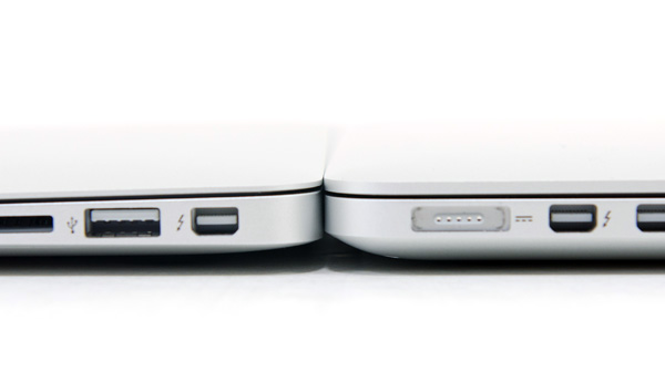
13-inch MBA (left) vs. 13-inch rMBP (right)
By virtue of the smaller display size and the next-gen MacBook Pro chassis, the 13-inch rMBP does a lot to blur the line between the Air and Pro lines.
13-inch rMBP: Form Factor Perfection?
I always liked the 13-inch form factor of the MacBook Pro, but I never liked the laptop itself. It always had too low resolution of a screen to be productive and it was too big and heavy to make sense compared to the MacBook Air. Once the 13-inch MacBook Air got Sandy Bridge, I pretty much stopped recommending the 13-inch MacBook Pro. You got a lower resolution display, and didn't gain enough to make the tradeoff worthwhile. Upgradability was a definite advantage, but most of the time when I'm making a personal recommendation to someone it's a person who isn't going to upgrade their machine regardless. When Apple revealed that the 13-inch MacBook Pro was still its best selling notebook, I was a bit surprised - although it did make sense.
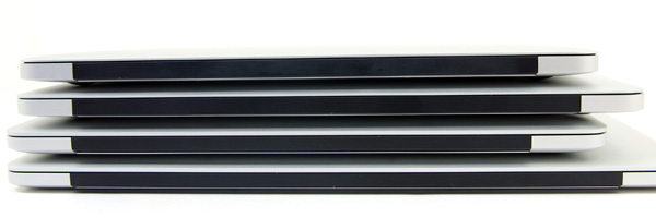
From top to bottom: 11-inch MBA, 13-inch MBA, 13-inch rMBP, 15-inch rMBP
The new 13-inch MacBook Pro with Retina Display changes all of that entirely. I'm now finding it more difficult to recommend the 13-inch MacBook Air, and have almost every reason to recommend the new Pro. The reduction in chassis thickness and weight give it an almost ultraportable feel. At 3.57 pounds, the 13-inch rMBP is light enough that traveling with it isn't a problem. Thanks to the smaller display, pulling it out on a crowded airplane in coach and getting work done isn't an issue either. The larger 15-inch rMBP still struggles in the airplane use case, although the reduction in thickness made it a bit better than its non-Retina predecessor.
| MacBook Pro with Retina Display Comparison | ||||||
| 15-inch MacBook Pro with Retina Display | 13-inch MacBook Pro with Retina Display | 13-inch MacBook Pro | 13-inch MacBook Air | |||
| Dimensions | 0.71 x 14.13 x 9.73" | 0.75 x 12.35 x 8.62" | 0.95 x 12.78 x 8.94" | 0.11 - 0.68 x 12.8 x 8.94" | ||
| Weight | 4.46 lbs (2.02 kg) | 3.57 lbs (1.62 kg) | 4.5 lbs (2.06 kg) | 2.96 lbs (1.35 kg) | ||
| CPU | Core i7-3615QM | Core i5-3210M | Core i5-3210M | Core i5-3427U | ||
| CPU Cores/Threads | 4/8 | 2/4 | 2/4 | 2/4 | ||
| L3 Cache | 6MB | 3MB | 3MB | 3MB | ||
| Base CPU Clock | 2.3GHz | 2.5GHz | 2.5GHz | 1.8GHz | ||
| Max CPU Turbo | 3.3GHz | 3.1GHz | 3.1GHz | 2.8GHz | ||
| GPU | Intel HD 4000 + NVIDIA GeForce GT 650M | Intel HD 4000 | Intel HD 4000 | Intel HD 4000 | ||
| GPU Memory | 1GB GDDR5 | - | - | - | ||
| System Memory | 8GB DDR3L-1600 | 8GB DDR3L-1600 | 4GB DDR3-1600 | 4GB DDR3L-1600 | ||
| Primary Storage | 256GB SSD | 128GB SSD | 500GB 5400RPM HDD | 128GB SSD | ||
| Optical Drive | N | N | Y | N | ||
| Display Size | 15.4-inches | 13.3-inches | 13.3-inches | 13.3-inches | ||
| Display Resolution | 2880 x 1800 | 2560 x 1600 | 1280 x 800 | 1400 x 900 | ||
| Thunderbolt Ports | 2 | 2 | 1 | 1 | ||
| USB Ports | 2 x USB 3.0 | 2 x USB 3.0 | 2 x USB 3.0 | 2 x USB 3.0 | ||
| Other Ports | SDXC reader, HDMI out, headphone out | SDXC reader, HDMI out, headphone out | GigE, FireWire 800, SDXC reader, headphone out | SDXC reader, headphone out | ||
| Battery Capacity | 95 Wh | 74 Wh | 63.5 Wh | 50 Wh | ||
| Price | $2199 | $1699 | $1199 | $1199 | ||
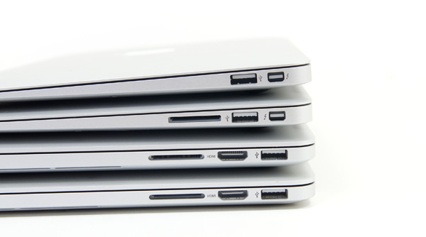
From top to bottom: 11-inch MBA, 13-inch MBA, 13-inch rMBP, 15-inch rMBP
The dimensions are very surprising. The 13-inch rMBP maintains a uniform thickness of 0.75-inches, 5.6% thicker than the 15-inch model (but obviously with less total volume thanks to a smaller planar footprint). Compared to the thickest point on the 13-inch MacBook Air however you're only gaining 0.07-inches. The weight difference is marginal as well. The 13-inch MBA shaves off only 0.61 lbs. The 15-inch rMBP is less than a pound heavier as well (0.89 lbs). Apple has done its best to make your decision about picking the right screen size and internals, almost entirely removing things like weight from the discussion. While the 13-inch MBA is still clearly a more portable device, I believe with the 13-inch rMBP Apple has built a chassis that's truly an alternative.
The downside to all of this is a machine that really can't be upgraded. Apple outfits all of the 13-inch rMBPs with 8GB of DDR3L-1600, although there's no BTO option for 16GB of RAM (which is availble on the 15). The integrated SSD module is removable, although it's not intended to be user serviceable. I don't believe the 8GB memory limitation will be much of an issue over the useful life of the system. If we assume 8GB is enough for the foreseeable future, providing more (or easily upgradeable) storage is my biggest complaint about the fairly fixed configuration. The good news is the SSD module can be upgraded and some companies do offer an upgrade path for it. We've already grown used to having notebooks with integrated batteries and CPUs soldered down to the motherboard, which makes the rMBP pill a lot easier to swallow.
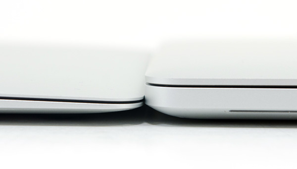
13-inch MBA (left) vs. 13-inch rMBP (right)
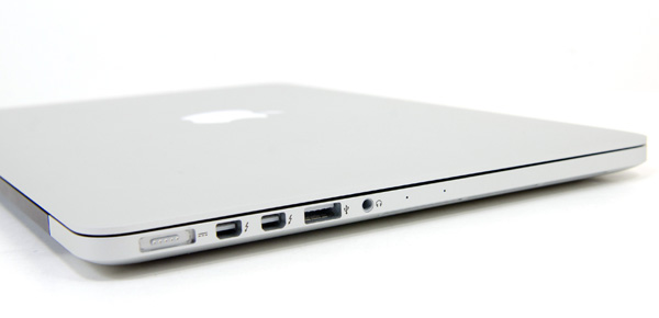
I appreciate the fact that there's no reduction in IO when moving between the 13 and 15-inch rMBPs. The 13-inch model retains the two USB 3.0 ports, two Thunderbolt ports, headphone/mic jack, SD card reader, and HDMI out of its bigger brother. Apple's MagSafe 2 connector makes an appearance as well.
The keyboard and trackpad remain very similar to the 15-inch model, although I feel like there's slightly more key travel on the 13. Neither system has the key travel of the older, non-Retina MacBook Pros but that's a sacrifice that seems like we'll be making more of as we pursue even thinner designs. I do believe that despite Apple's pursuit of a very thin chassis that it continues to deliver a very usable keyboard with great feel. I've typed tens of thousands if not hundreds of thousands of words on Apple's current crop of keyboards, and they still manage to hold up quite well.
The trackpad shares a similar story. The glass covered trackpad of the 13-inch rMBP is similar in size and identical in feel to the trackpad on the rest of Apple's mobile lineup. The 13's trackpad performance and behavior remains among the best in the industry.




79 Comments
View All Comments
MrCromulent - Tuesday, November 13, 2012 - link
Thanks for the thorough review! I was really looking forward to the 13" version of the rMBP as a possible desktop replacement machine for development, but I guess I'm going to pass this year.Multi-monitor performance (internal display plus 2 external ones) would be excruciatingly bad, I presume? Or is it acceptable because most of the stuttering seems to be caused by CPU issues instead of a GPU bottleneck?
Freakie - Tuesday, November 13, 2012 - link
I would encourage you to pass. This 13" rMBP has COMPLETELY lost it's "Pro" name. Dual-core with no dedicated GPU, only 8GB of RAM, paltry amounts of storage, and a screen that's only good for resolution, not for quality, makes this a stupid choice for any art professional. The thing can't even run a Safari window with Facebook on it without dropping below 30fps! Add the $1,700 price tag to all of this and you have to be out of your mind to buy it. And trying to multi-monitor is going to drive you nuts performance wise.And now for a slight rant on the Review it's self:
"You don't sacrifice display quality at all in the move to the smaller panel. Brightness, contrast and color reproduction are all great."
This line particularly bugged me, which shows Anand's bias for Apple yet again. Brightness is good, not great, and color reproduction is horrendous. You DO sacrifice a lot in switching to these displays. Artwork on this display is color suicide. And I haven't seen a computer screen have after images like you described in well over 6 years. In my opinion quality has gone WAY down.
So not only is your built-in display crappy for work, but if you plug another screen in then suddenly you've maxed out your CPU's performance, and that's before you've even started working.
I'm sorry, Anand, but this entire review seems to dock points off again and again, and yet you still manage to say that it's nearly perfect in your conclusion. While I do appreciate that you've been more forward towards issues on the devices in your Apple reviews as of the last few that you've done, in the end it seems like you just conveniently forget about them and write apologetically about them where as Dustin would, and does, expose all of a laptop's flaws and strengths and does a good job of not sugar coating or glazing over problems. When Dustin sees a machine not living up to what it is supposed to be, he doesn't pull back any punches and calls it out. It seems obvious that this machine is not "Pro" in any way imaginable and I really feel that should have been pointed out.
guidryp - Tuesday, November 13, 2012 - link
Nice Rant. Too bad it is nonsense.Horrendous color reproduction?
The screen has the best contrast of any tested and the second best color accuracy. Also this is an IPS screen with superior color stability vs angle of view. Much better than the TN screens that occupy the vast majority of laptops. It is a fantastic screen in terms of resolution, color accuracy, contrast and color stability.
Image retention is the only real fault and if it was a significant issue, return it.
As far as it losing "Pro" status for not having quad core/discrete GPU, that is no change, it was like that last year as well. If this is your definition of Pro, I am sure you can find a suitable cheap Dell that has quad core.
Bottom line. I do think it is probably early to jump to this Retina Model because of potential performance hiccups, and you are better off waiting for a Haswell model. But there is no need to resort to nonsense ranting to state that.
Freakie - Tuesday, November 13, 2012 - link
IPS means next to nothing. It's just one small part of the entire range of components and technologies that go into making a good display. IPS is chosen for high resolution displays for different reasons other than color.And it's Delta E value gains nothing from being second best, as best is so far ahead of it it's ridiculous. Anandtech's method of obtaining Delta E is taking the best value after repeating the test multiple times, and with how close it is to so many other monitors, and how even a screen being on for 5 minutes versus 10 minutes can affect screen color tests small amounts, it actually isn't that hard to summarize the test results by saying that it essentially has the same color representation as the 5 notebooks behind it.
And Color Space is VERY important for artwork. It's nice to have a good Delta E but without a wide color space, you're still shooting yourself in the foot and your results will be noticeably inconsistent and will require a lot more fiddling within your editing programs to get right.
And my definition of Pro is what the MBP used to be, a powerful laptop that could reliably be used for professional work when you aren't at your desk and that sacrificed some weight and size in order to deliver the power that you need. This MBP does not live up to the MBP name and should just be a regular Macbook (but of course they got rid of those and just turned the MBP's into normal Macbooks).
But no thank you on the Dell :) I wouldn't never own one of their consumer models and their professional models are rather pricey. I'd rather just Build-To-Order a nice ASUS and pay the extra $100 for the 95% NTSC Gamut Matte screen.
guidryp - Tuesday, November 13, 2012 - link
95% NTSC screens are just about useless for 99.99% of users.We live in an sRGB/Rec. 709 world, and that should be the goal for most screens, and the Retina MBP is very close to this much more important standard. Actually Anand should actually report the sRGB match in his reviews since it is so much more important for most users.
Wider gamut than sRGB screens simply cause more problems than benefits, causing jarring color inaccuracy as you move back and forth between color managed and non color managed applications.
It is a fallacy to simply think, a bigger number is always better when it comes to color gamut.
Freakie - Thursday, November 15, 2012 - link
It's not for 99.99% of users, MacBook Pro's were meant for professionals, but now because Apple wants more money, they got rid of the regular MacBooks and put crappier hardware in their Pro's. So for the people who buy the Pro's because they need a Pro machine, a 95% NTSC DOES matter.And even in the sRBG the Retina displays suck. 64% of AdobeRBG is still below 90% sRBG so it doesn't get any extra points even if you wanted to try to argue that for some reason sRBG is better. And I would disagree that wider than sRBG is problematic, especially when switching between color managed situations. Yes, switching from a non-calibrated screen from a calibrated one is weird if the non-calibrated one sucks, but who cares? The whole point of having the wide gamut, calibrated screen is so that your work comes out correct, not so that your browser window looks right -_-
And it's not fallacy :P When you're working on something that you're going to print, or display through high resolution means like digital signage or movies on a projector... Those devices and mediums that your are going to be displaying it through will have wide gamuts. Obviously print has a wide gamut, and most digital signage uses the same 32"+ high resolution high gamut displays, and a professional movie projector for films will also have the same. So if you work on your project on an sRBG screen you will be sorry when you see it displayed/printed elsewhere.
jmelgaard - Thursday, November 15, 2012 - link
I Seem to be confused here... But you seem to imply that you only belong in the professional segment if you use your computer for graphical work?...Damn... And here I thought I used mine for Professional Application Development... BUMMER!... Ill better start looking for another job, one with Pictures and Colors and Gamuts and Colors and OMG my head hurts now...
WebJester - Tuesday, March 26, 2013 - link
I see you glossed over the comment about calibration.aguilpa1 - Tuesday, November 13, 2012 - link
Color reproduction was only part of his reasons for noting that there should be a distinct difference between a Macbook and a MacbookPro. I have to agree with him. The Pro was for Professionals that did not mind the extra weight or size as long as they could get the options and upgrades they needed. The fact that you mention stupidly that maybe he should go get a Dell if he wants a 4 core CPU should slap you in the face as obvious that the MacbookPro is not a Pro if a cheaper model offers what it does not.TEAMSWITCHER - Tuesday, November 13, 2012 - link
I have been waiting for this review, because I already upgraded from an older 15" dual-core MacBook Pro to this laptop. I did notice the minor "choppiness" when scrolling web pages, but it's not intolerable. I was expecting the HD4000 to be a total dog at 3D. To my surprise it wasn't all bad. To be honest though, I play mostly older games.The display is easily...hands down...no questions about it...the best I have ever used. Game over - thank you for playing. Now, when I look at non-retina displays, I immediately notice the difference - and I don't like what I see. I desperately want a 27" Retina Thunderbolt display. Maybe they can add discrete graphics to the display for the best of both worlds. Please Apple, make this happen.
But where this laptop really shines is it's portability. Having used a 15" Pro laptop for the last eight years, the difference is striking. I was tempted by the 13" MacBook Air, but the grey bezel around the screen felt like a step back from the edge-to-edge glass that I have grown to love. This feels every bit like the Pro Machine I have been using for the last three years. I can't express how comforting it was to drop so much weight, yet retain the same great keyboard, trackpad, quality construction, and performance. Truly an amazing feat and why the "Pro" moniker is deserved.
This isn't the laptop for everyone, but for me...web browsing, coding, and just always having a great computer at my finger tips...it's pretty close to perfect.