Apple Announces the Apple Watch; Available Next Year
by Joshua Ho on September 9, 2014 2:06 PM EST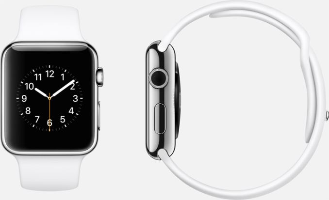
Apple has thrown their hat into the wearable ring with the Apple watch, which tries to bring a better user experience to the watch without trying to adapt iOS to the watch with multi-touch gestures that we're familiar with on the iPhone.
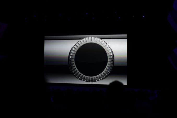
There's a single crystal sapphire display, a digital dial crown that acts as a home button and a scroll system. There's also a strong emphasis on haptic feedback which allows for linking of watches to share notifications by sending taps in any possible pattern. This is done by using a force sensitive touchscreen, which is a method of navigating along with the scrolling dial. This allows for subtle communication that doesn't rely on obvious sound or gestures. It's also possible to send taps based upon pulse/heart beat.
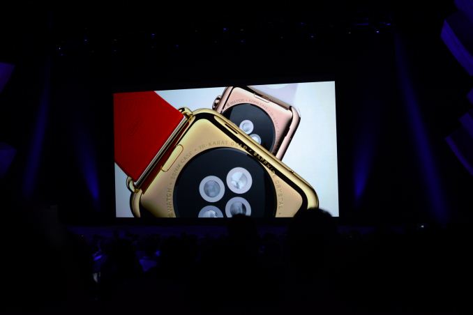
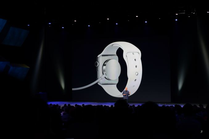
There are IR lights and sapphire lenses on the back of the watch for heart rate and serves as a magnetic alignment wireless charging system. The accuracy of the watch is no more than 50 milliseconds off at any time.
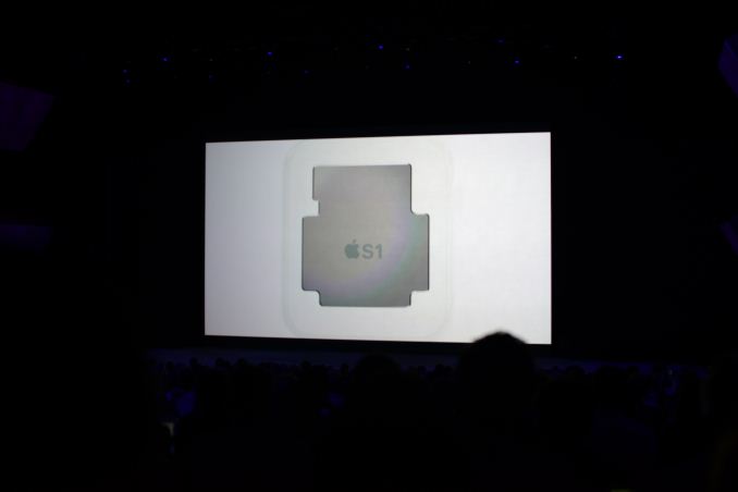
In order to support this watch, Apple has also designed a custom SoC called S1, likely for battery life and sensor integration and reduction of board area.
There are six different straps that are easily exchanged. The sport band has multiple colors and is some kind of rubber. There's a leather sports strap which has multiple magnets to ensure that the fit works correctly. There's also a traditional leather strap and a stainless steel link bracelet. There's also a stainless steel mesh band that is infinitely adjustable. There are also two versions of each watch edition, one larger and one smaller.
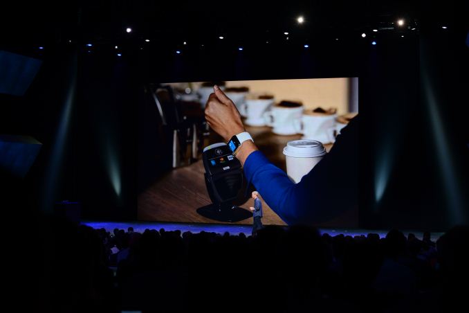
The Apple Watch also has NFC and will work with Apple Pay.
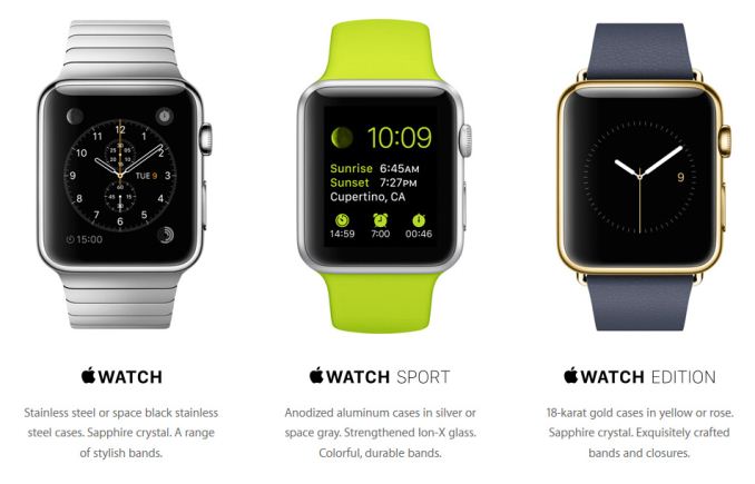
There are actually three variants though, which include the standard Apple Watch, Watch Sport, and the Watch Edition which has 18 karat gold for the casing. The sport edition has a anodized aluminum casing.
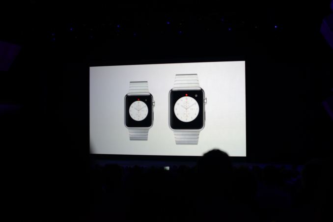
Furthermore the watch will also come in two different case sizes to account for different wrist sizes (essentially his & her watch sizes). These sizes are 38mm and 42mm tall respectively.
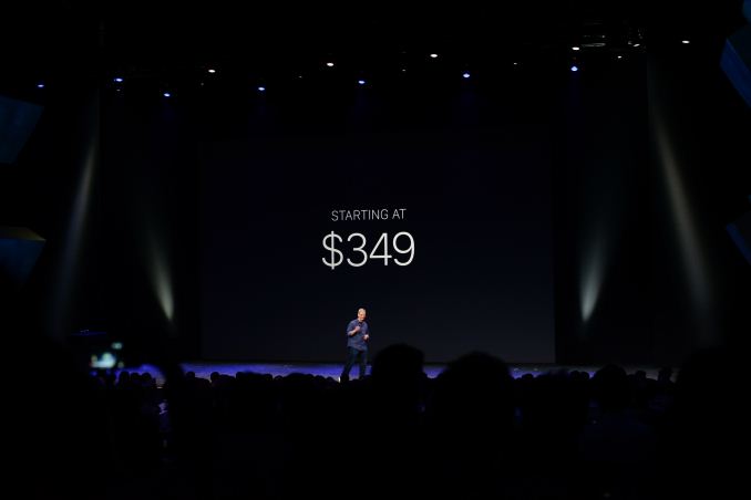
The Apple Watch must be paired with an iPhone to work properly. It starts at $349 USD and will go on sale early 2015.




122 Comments
View All Comments
Laxaa - Tuesday, September 9, 2014 - link
To be honest, it looks kind of bad. Way to "chunky" looking.The Moto 360, while not perfect, looks a lot better in my opinion.
mscrivo - Tuesday, September 9, 2014 - link
Completely agree.cappiels - Thursday, September 11, 2014 - link
NO WAY.... the Moto 360 is FAT... VERY thick when you look at it from the side.. compare the Moto 360 with the Apple Watch in person.. you will rather have the Apple Watch on your wrist, I guarantee it!daveloft - Friday, September 12, 2014 - link
All smartwatches are fat. But the Moto 360 is thinner than the Apple Watch. Moto 360 is 11.5mm thick and the Apple Watch, both 38mm and 42mm versions are 12.46mm thick. Source: http://www.gizmag.com/moto-360-vs-lg-g-watch-r/337... & http://www.paulsprangers.com/2014/09/apple-watch-d...NEDM64 - Monday, September 15, 2014 - link
OMG, does anybody care about that, and a difference of less than 10%, where the shape is more important to your comfort than anything else?It's about the height of an human finger, and that's the normal height for a modern watch. And what about batteries and sensors?
The only sub-10mm i can think of are dress watches that are completely different form these casual/sports watches...
55Tan - Tuesday, December 9, 2014 - link
The Apple Smartwatch is nothing like the other smart watches on the market (I'd recommend seeing a ranking like http://www.topreport.org/wearable/ instead).ol1bit - Friday, September 12, 2014 - link
I now own a Moto 360, and it is not fat at all. I have many real watches that are fatter and heavier than the 360! Oh and it looks awesome in real life as well!piroroadkill - Tuesday, September 9, 2014 - link
Yeah, it's remarkably ugly and similar to pretty much every other old cheap smart watch.The Moto 360 is a pretty device with a terrible old SoC that gives it sluggish performance and dreadful battery life, which was a stunningly poor decision.
So now roles are reversed with the usual deal: Apple has the ugly, fast product, and in the Android camp, Motorola has the much more beautiful product that is slow.
Laxaa - Tuesday, September 9, 2014 - link
Yeah. I don't know what Moto was thinking using a OMAP 3 in the 360.lcdsantos - Tuesday, September 9, 2014 - link
And about LG G watch R?