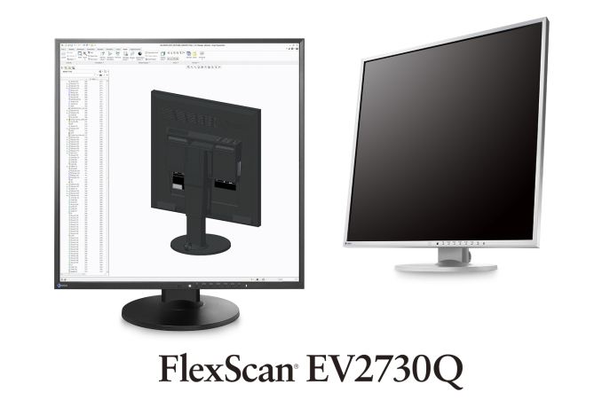
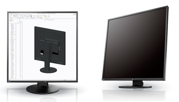
EIZO Announces the IPS 26.5” FlexScan EV2730Q Monitor with 1920x1920 Resolution
by Ian Cutress on November 19, 2014 1:18 PM EST
I will be honest, the nearest I think I have come to a square monitor is the 1024x768 panel I use as a tiny second screen on my main computer. When I first saw EIZO’s press release regarding this new 1920x1920 monitor it took me aback, imagining what it might feel like to actually use. The consumer monitor market is expanding to various screen sizes, usually following 16:9, 16:10 or 21:9 for the most part. But after a few minutes, I realized that non-standard monitor sizes are most likely abundant in various industries, such as medical, when they are designed for a specific purpose and quality. So while a 1:1 monitor is something interesting to see in the consumer space, perhaps it might not be so new when considering industrial use scenarios. That all being said, it would be interesting to see this one in the flesh.
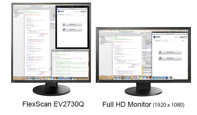
1920x1920 means 3.7 megapixels, the same as 2560x1440. This compares to the regular desktop sizes of 1080p (2MP), 1200p (2.3MP), 3200x1800 (5.8MP) and 2160p (8.3MP), which indicates that if this monitor were to be used for gaming, performance would put it directly in the 1440p category. That being said, EIZO is not exactly targeting this monitor for gaming. The more vertical space provided is better suited to writers, coders or CAD who require many items on the screen at once, often side by side. As an editor, I often have an image on one side of my screen while writing my reviews on the other, so I can certainly see this marketing angle.
The basic specification list gives the IPS-based EV2730Q as a 16.8 million color display with 178 degree viewing angles, a 300 nit brightness, a 1000:1 contrast ratio and 5ms gray-to-gray response time. Video inputs are via DisplayPort and a dual-link DVI-D, with a maximum refresh rate of 60 Hz. Two 1W speakers are built in, along with a 2-port USB 2.0 hub. 100mm VESA is supported with 344º of swivel and 35º/5º of tilt. Height is also adjustable.
The button controls are on the front of the panel, and EIZO gives three profiles called sRGB, Movie and Paper along with two user customizable profiles. The Paper profile is designed to reduce the amount of blue in an image to prevent eyestrain while reading or coding against a white background. A feature called Auto Ecoview can detect the ambient light level and adjust the screen’s brightness to reduce eyestrain and power. This can also detect when a user leaves the desk to power down the monitor, with power on when the user returns.
We are contacting EIZO to find what markets the EV2730Q will be sold in as well as the prices. EIZO has announced that the monitor will be available from Q1 in 2015, but this will vary by country. With any luck, it will be on display at CES.
Source: EIZO via TFTCentral


70 Comments
View All Comments
slashbinslashbash - Wednesday, November 19, 2014 - link
Glad to see some experimentation in the more-square direction. I used a 1280x1024 (5:4) monitor for several years at work and found it to be a decent aspect ratio for a lot of use cases.secretmanofagent - Wednesday, November 19, 2014 - link
What were your use cases? I'm curious.dragonsqrrl - Wednesday, November 19, 2014 - link
Could work well for document or portrait views, scripting and coding.psychobriggsy - Thursday, November 20, 2014 - link
This would definitely be wonderful for coding. IDEs often end up cluttered because of the lack of vertical space due to the 1080p scourge.But now I find myself wanting a 2560x2560 version of this monitor...
tracker1 - Thursday, November 20, 2014 - link
I think that IDEs really should adopt to utilize the horizontal space better... I mean a lot of the utility bars on the top could be on the left, and I already use the sides for directory trees, etc... it really depends on your workflow... usually my IDE is 2/3 of monitor 1, and the other third is actual directory windows... monitor 2 is split with command prompts and browser windows.Hrel - Friday, November 21, 2014 - link
VS 2013 is pretty good about this.microdesigns2000 - Thursday, October 3, 2019 - link
A wider monitor will encourage developers to write more function on a single line. When I develop in VS or Studio Code, scrolling up and down is a hassle. I recently rotated my two 1920x1080 monitors. This makes a huge difference in coding. I also develop in ladder logic. Horizontal monitors are good for that because logic is written from left to right. I also use cad packages. When I stretch cad across two monitors in portrait view, I have a square workspace. The high number of pixels really helps to avoid so much panning and zooming. I came to this article because I realize how much better the square format is, if there are enough pixels.1920x1920 seems to be good enough. 2560x2560 would be better.owan - Wednesday, November 19, 2014 - link
I'm currently using a 1440x900 and a 1280x1024 monitor at work, I find the 1280x1024 to be superior for more vertically oriented spreadsheets and e-mails where the extra pixels make a difference in being able to see a few more rowsSmoken - Wednesday, November 19, 2014 - link
I use 2 1920x1200 monitors, one is in landscape mode and one is in portrait mode. Works great for coding.p1esk - Wednesday, November 19, 2014 - link
Yeah, portrait mode for coding is a no brainer... Been using it since 2005. Actually, the portrait mode is better for anything other than video. Just look at this webpage layout - 2/3 of the screen real estate is wasted when it's viewed on a 27" landscape monitor. And 4/5 of the page content is hidden at any given time.