A Look At The Changes In The Android M Preview
by Brandon Chester on May 29, 2015 8:00 AM EST- Posted in
- Smartphones
- Google IO
- Tablets
- Android M
Today during Google I/O 2015's opening keynote Google announced the latest release of their Android operating system. The new version of Android is using the code name Android M, much like how Lollipop was initially referred to as Android L. While Android Lollipop was a major release with many new features and a comprehensive redesign, Android M goes back to basics, and focuses on polishing what Google introduced with Lollipop. That isn't to say that there are no new features or design tweaks, but they are not on the same scale as Lollipop's changes. It may be best to think of Android M being to Lollipop what Jellybean was to Ice Cream Sandwich.
When Google originally announced Android L at Google I/O last year, they released a developer preview so developers could prepare their apps for the new operating system, as well as for both developers and Android enthusiasts to provide feedback about the changes that were being made. Google has done the same thing with Android M, and they have committed to releasing over-the-air updates to the developer preview on a monthly basis.
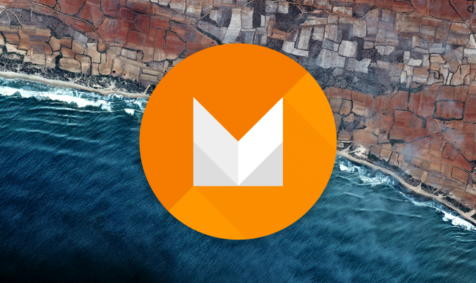
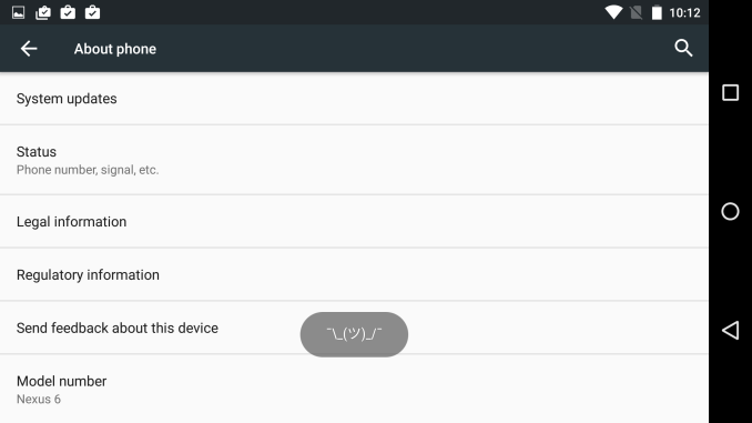
While I'm hopeful that the final name of this next Android release will be Android Muffin, we won't know details about the name of the new OS for quite some time. Opening the Android M Easter egg in the About phone section of Settings shows you the new Android M logo which you can see in the cover image of this article. Long pressing on that logo kicks you out of that section and presents you with the increasingly common Tsu (ツ) emoji. Google clearly enjoys the speculation from users and the press about what the final name will be.
While we don't know the full name of Android M, we can look at some of the changes that are included in the developer preview build that Google has released. All of these features are obviously subject to change, and some will most certainly change as users and developers give feedback on them in the coming months. I'm just taking a look at what changes have been made so far to see where Google is headed, and to cover some of the changes that were too small to be mentioned during Google's keynote.
Launcher Changes
Android Lollipop on the left, Android M on the right
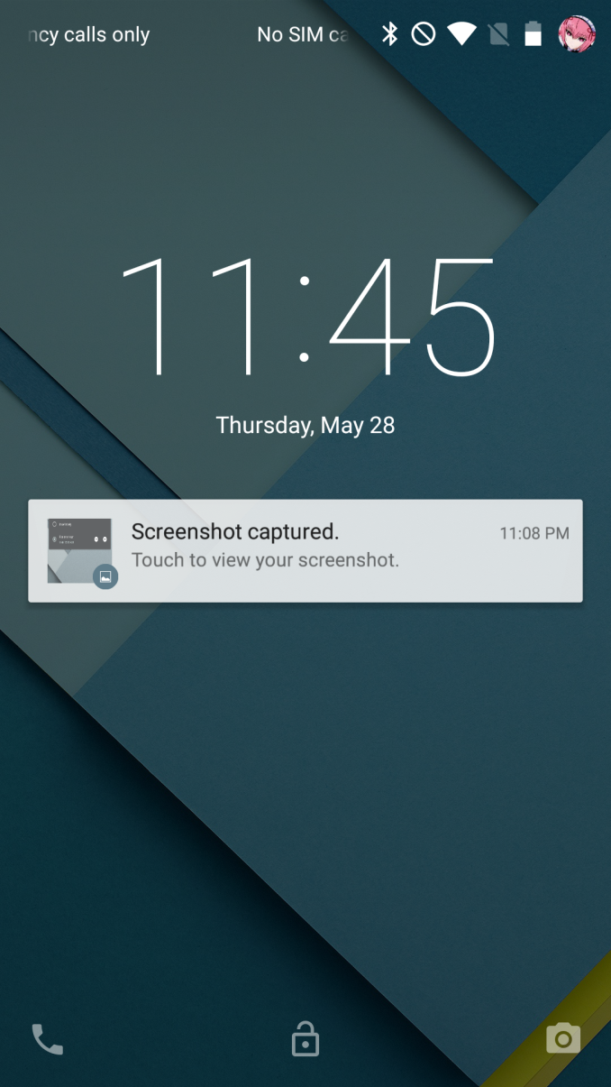
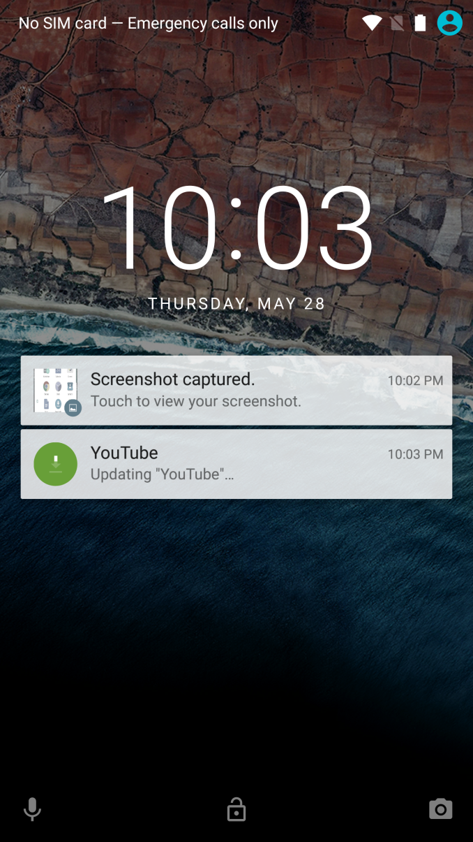
The first thing you're likely to notice after installing the Android M preview is that Google has included a new wallpaper which is set as the default option. They've also made some notable tweaks to the lock screen. The most obvious is the change to the clock and date. Not only is the text more bold, but the altered spacing between characters may mean that we're looking at a font other than Roboto, or at some special version of Roboto. I've never been very good with identifying fonts so I couldn't say for sure, but I personally prefer the thinner look of the original clock.
On top of the new font, Google has also replaced the phone dialer shortcut with a voice search shortcut. I would love to know if this is the result of data showing that people rarely used the phone shortcut. The phone part of a smartphone now seems more like an additional app on what is really a computer in your pocket.
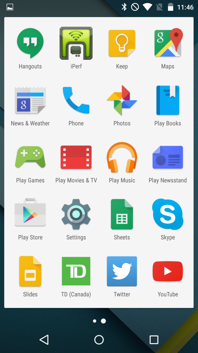
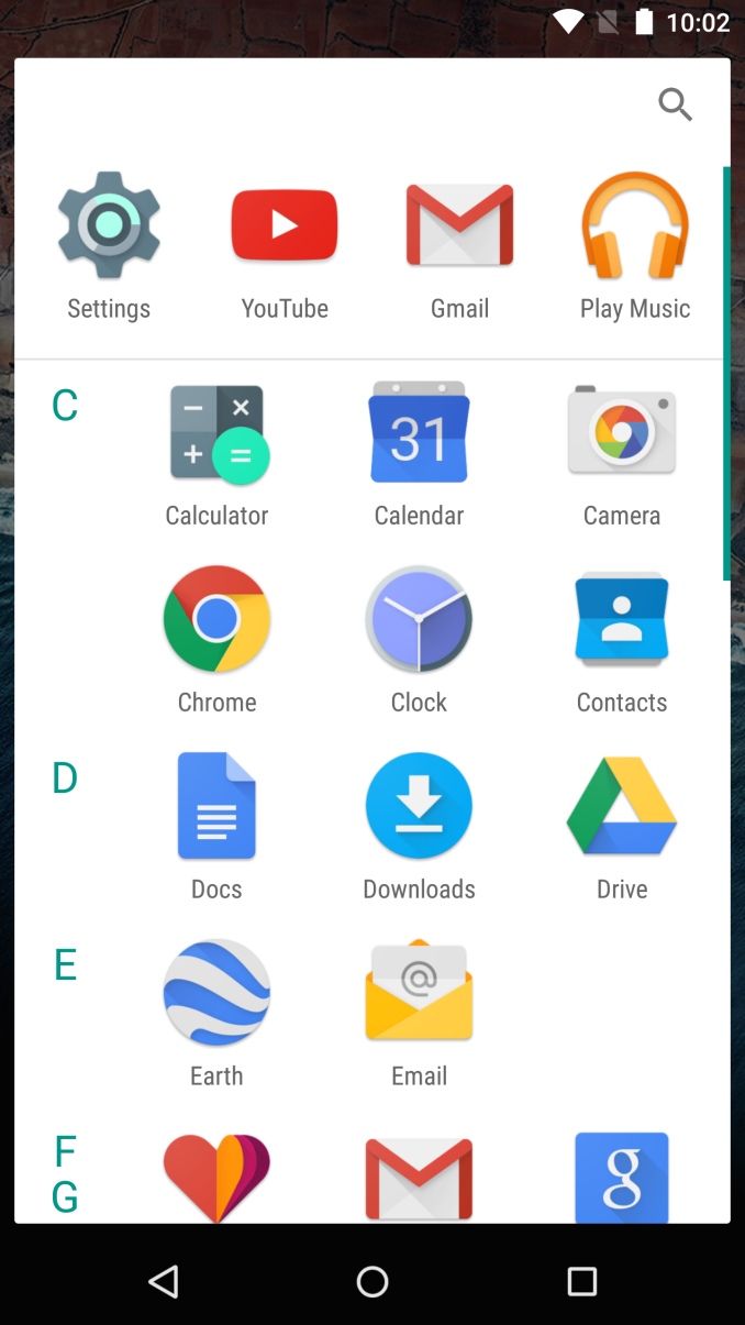
Android Lollipop on the left, Android M on the right
Not much is tweaked with the home screens of the Google Now Launcher in Android M. You still get the same grid of icons, with the leftmost home screen being Google Now. Once you enter the app drawer you'll see that Google has made some significant changes after all. The big change is a switch from having pages of apps that you scroll horizontally between to having a continuously scrolling vertical list of apps. From a functional standpoint, this layout is similar to how the app drawer was designed in older versions of Android from Gingerbread and prior.
There are also some changes at the top and on the side of the new app drawer. Based on some quick testing, I believe that the row of four icons on the very top are your four most commonly used applications. Above those is a search bar for those users who have so many applications that scrolling to them becomes a chore. Since the drawer is organized alphabetically, Google has made finding apps easier by putting letters on the left side which indicate the first letter of the app names that you're currently viewing.
App Permissions
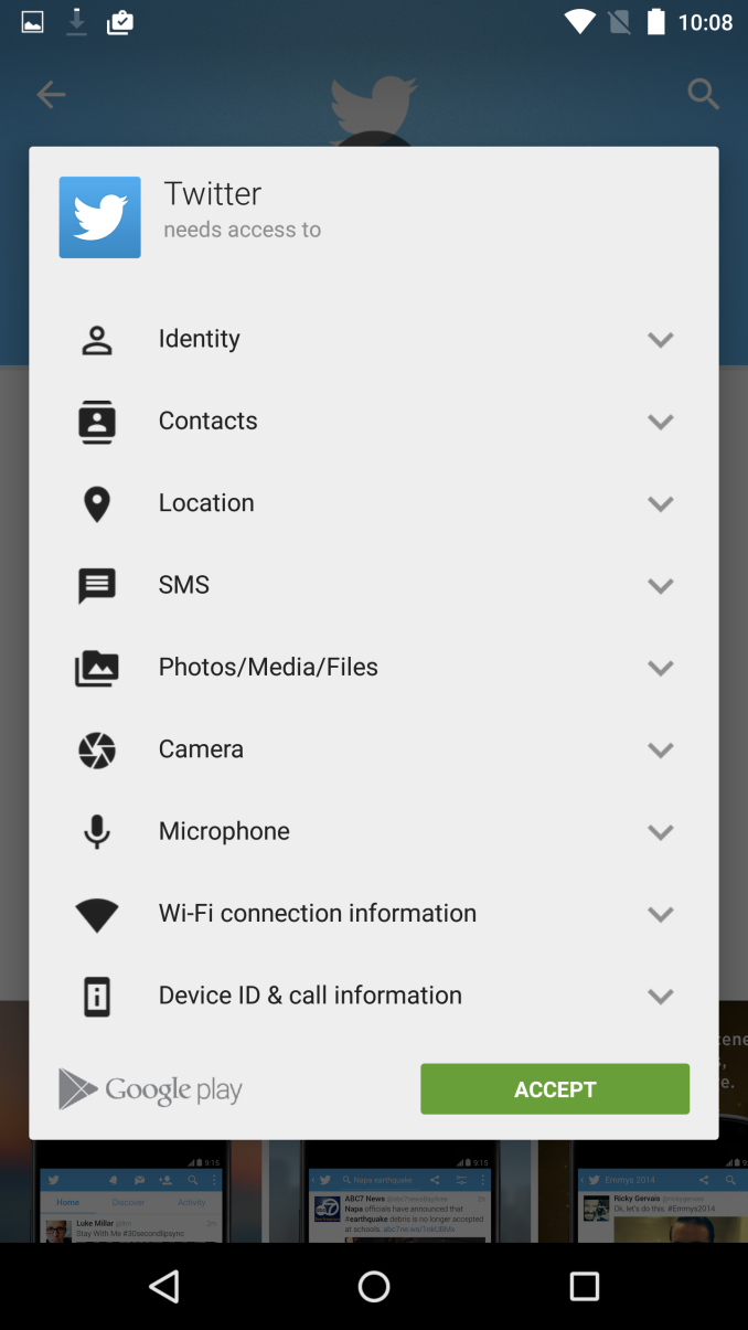
Something I've desired for a long time is a revamp of the permissions system on Android. Quite frankly, I feel like the system prior to Android M was a complete and utter disaster. The reason is that if there was a single permission that you didn't want an app to have, then you were barred from installing that application. Permissions were also grouped poorly, and sometimes apps would have to ask for permissions that made them seem malicious but for some obscure reason were required for part of that app to function. In Android M, Google has resolved both of my concerns by changing the system to ask permission at the time a function of the phone needs to be used rather than at the time of install.
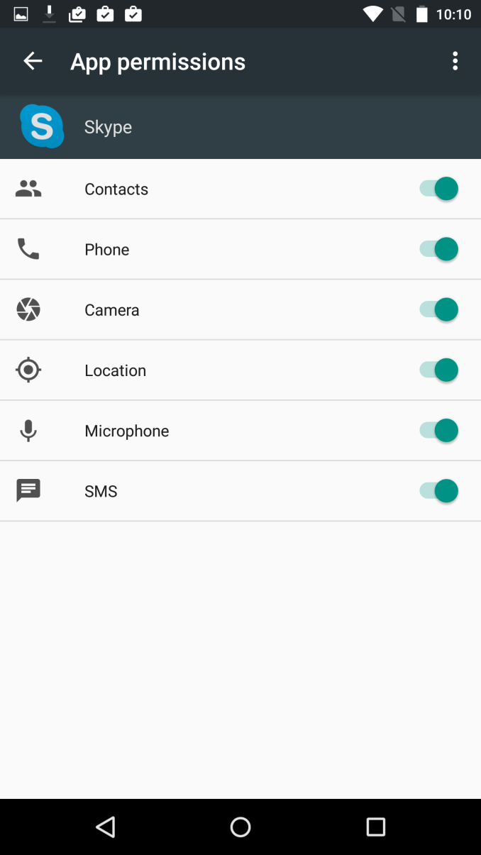
Since the permissions system is a key part of Android, it wasn't possible for Google to bring their new system to older applications. Because of this, the screen above with a list of permissions that you need to accept at the time of install won't be going away any time soon. However, Google has been able to implement part of their new permissions system, and if you take the time to use it you can control which permissions an application has access to. This can be done by going to the Apps menu in Settings, selecting the app, and then selecting permissions. This brings up the list you see in the right image above, and you can enable to disable permissions at will. I think this is a huge win for users and their privacy, and it will be even better when developers update their applications so that users can just accept or deny permissions as they are needed.
Copy and Paste
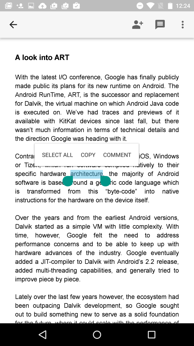
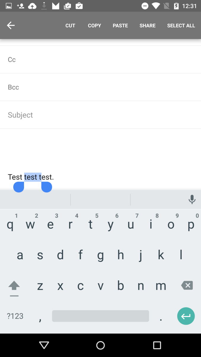
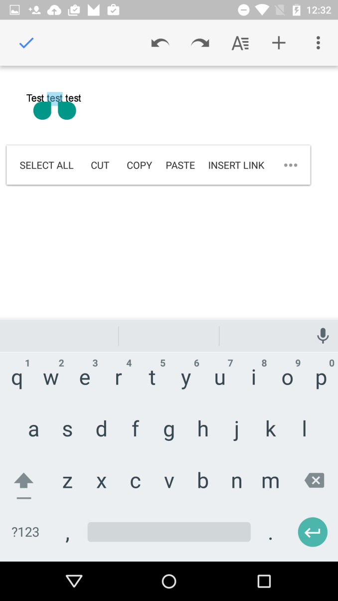
One of the smaller improvements that Google noted during the keynote was a new system for copy and paste. Rather than having a group of unlabeled options appear at the top of the phone, a floating menu would appear over the text that was selected with the available options. It's basically the same way iOS and Windows Phone handle copy and paste, and it's not surprising to see all the operating systems converge on this way of doing it as it really does seem like the best way to handle it.
Unfortunately, as of right now it doesn't seem to work properly in every application. Above you can see Docs, Gmail, and Chrome, and each of them present a different menu for copy and paste. Docs supports the new floating menu, Gmail now uses text instead of unlabeled icons but still has it at the top, and Chrome is unchanged in its behavior. The new feature where words would be selected in chunks surprisingly only worked in Gmail which doesn't even support the new menu properly.
Thankfully, the feature worked perfectly in third party apps like Skype and Twitter just fine. I was concerned when Google's own applications weren't cooperating with the new feature, but it appears that they are the exception rather than the rule.
Volume Controls
Android Lollipop Volume Menu
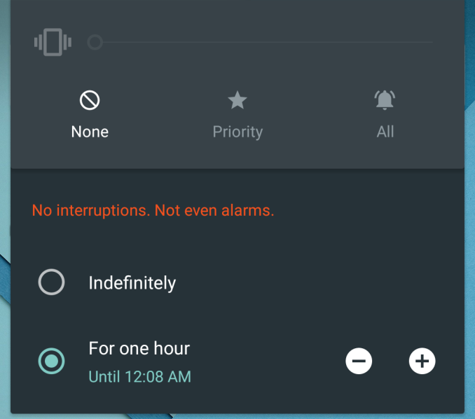
Another smaller change in Android M that Google made note of is a change in the behavior of volume controls. Google was clearly aware of the user confusion caused by the new system they introduced in Android Lollipop for handling when the phone was muted, as they made a point of asking how many members in the Google I/O audience didn't like the changes. The problem was fairly simple. In older versions of Android, hitting your volume down button at the lowest volume level would enable a vibration only mode, and hitting it once more would enable silent mode. Android Lollipop made some strange changes that made it seem like silent mode was removed, and instead added three options which defined what notifications would be allow to trigger a vibration. While this was actually a nice feature for allowing only certain contacts to trigger notifications, it was implemented in a clumsy manner that confused users.
In Android M, the volume options have been greatly simplified. When hitting volume down while vibration only mode is enabled, all sounds and vibrations are completely disabled, with the exception of alarms. This still poses a problem for users who want to have their phone be completely silent no matter what the circumstance is. For that, users will need to take a look at the new Do Not Disturb toggle in the Quick Toggles section of the Notification Drawer.
To me, the new system in M is better, but it's still not perfect. I don't understand why Google feels like Do Not Disturb needs to take the place of silent mode by allowing you to block all sounds, with the volume mode accessible via the volume buttons limited to still allowing alarms to be triggered. iOS has had a Do Not Disturb feature for years now, and it coexists perfectly with the ability to have a silent mode that blocks all alerts or vibrations.
Other Tweaks
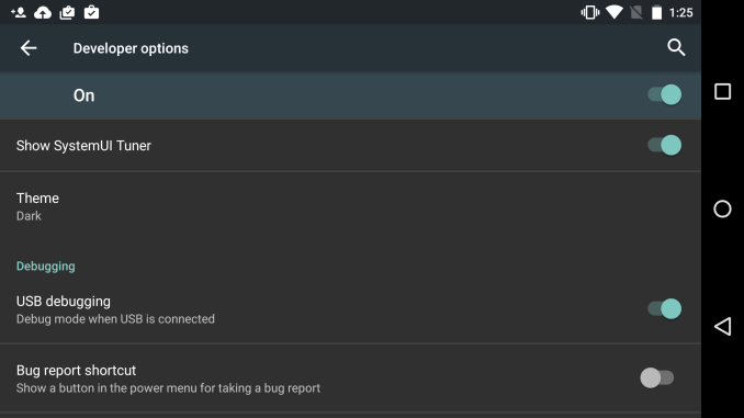
The Developer options section of the Settings app also has a couple interesting new feature additions. The first is a Theme option which allows you to select a Light or Dark theme, much like the ones that you can select for the keyboard. At present it only changes the appearance of the Settings app, and it's unclear if this will ever be extended to other applications or parts of the operating system.
The second interesting new feature in the SystemUI Tuner. The design of the menu makes it clear that Google plans to add more options here in the future, but right now it allows you to tweak the toggles that are available in the Quick Toggles part of the Notification Drawer. After removing the rotation lock toggle, the SystemUI Tuner began to crash upon opening for me, so I would recommend not altering any toggles that you use frequently.
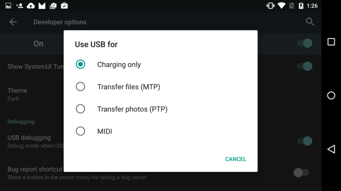
The last change that I've noticed during my time using the Android M preview is this new menu for choosing what you want your USB connection to do. Google showed this off during their keynote, but with a different purpose. At the moment, it allows you to choose whether you want to just charge your device, or whether you want to connect via MTP or PTP to transfer files. This is probably to defend against attack vectors like hacked USB chargers, but the menu will also be very useful when USB Type C becomes common among devices as it will allow you to negotiate which device is going to charge the other. This means you could potentially recharge your phone from your tablet's larger battery.
These impressions all relate to the user-facing changes in Android M. Because this is a release that focuses on polish and bug fixes, there are a lot of changes under the hood that are hard to easily examine and evaluate, and some of the most amazing ones such as the new Now on Tap feature are yet to be implemented. However, what I've seen so far is very promising. As both Android and iOS are reaching a point of maturity after their respective redesigns and feature additions, I openly welcome a focus on polish and under the hood changes that will improve the user experience in ways that the user will not directly see. That's clearly the philosophy Google has adopted with Android M, and it will be very interesting to see how it evolves in the next few months as Google releases more developer previews to show us where they're headed.





88 Comments
View All Comments
Chillin1248 - Friday, May 29, 2015 - link
All this is nice, but what does it really matter if Google can't figure out how to push out updates to Android devices in a reasonable manner and speed? The fragmentation level of Android is borderline absurd.texasti89 - Friday, May 29, 2015 - link
I don't think this is Google's problem. They make the whole platform open source to everyone including Smartphones companies which are to be blamed here. Targeting a Vanilla Android on a smartphone is much easier and faster than spending huge resources to build layers upon layers of custom UI and uninstallable bloat.Chillin1248 - Friday, May 29, 2015 - link
My next phone is probably going to be an iPhone. I've been with Android since the beginning, but the bugs, stability and lack of updates is going to force me with Apple. I litterally spent hundreds of hours getting my Nexus 4 and now LG G2 to the state where they are stable and working (with decent battery) while offering the services and options that they should have in the beginning.I'm tired of rooting, installing several ROM's to find a stable one/one with good features, deleting system files, tweaking the build prop, installing Xposed (and all the nonsense with it), etc., just to get a stable system and long lasting system.
Not saying Apple is a million times better, but it's godamn easier to live with and gets timely updates. Even after searching through all the Kernels and ROM's, the latest stable one's for my LG G2 (a year and 8 months old flagship) is Lollipop 5.02, with 5.1 (forget about Android M) nowhere on the horizon. The Lollipop update (from 4.4.2, not 4.4.4 even) took over 6 months to arrive from Lollipop's release.
mr_tawan - Friday, May 29, 2015 - link
You can just go with the Nexus Devices.tarqsharq - Friday, May 29, 2015 - link
I second that.I love my Nexus 5.
Samus - Friday, May 29, 2015 - link
What's the advantage of a Nexus over an iPhone, they're both expensive and they both come in one flavor.The whole idea of Android was to bring diversity to the market: lots of unique phones like the Yotaphone, lots of different form factors like sliders and even flip-phones. But without Google taking updating seriously, it pushes people away who actually care about security, updates, bug fixes, and enhanced features/improvements over time.
This is why iPhone continues to sell so well. The iPhone 4S is still supported, and contrary to popular belief, DOES RUN iOS 8.3 WELL.
So, this IS Google's problem, because they are in effect, acquiring less users through less devices sold, and at no time have more people been switching from Android to IOS than now. The iPhone 6 was proof of that. 61 million units sold in a month aren't coming from 61 million previous iPhone users. There were a hefty number of Android converts in there. And sure, many of them used Android because that was the only way to get a smartphone with a large screen (except for a few WinMo devices) but many people like myself left Android because the support was just crap.
Google relying on OEM's to keep devices updated and secure, in effect depending on them to hold the perception of quality to a high bar, is like Honda depending on Takata to keep their vehicles safe with quality airbags. In the end, who do you think the end-user is going to remember, Honda or Takata? This affects Honda's bottom line, just like Samsung having a bad rep for not supporting phones affects Google's bottom line.
Google needs to man up and deploy a universal update system that works around OEM customization. I don't see why an Android update or even an entire ROM can't be deployed on top of a Touchwiz ROM keeping the OEM tweaks in place.
mkozakewich - Saturday, May 30, 2015 - link
The Nexus 5 isn't expensive.whiteiphoneproblems - Tuesday, June 2, 2015 - link
It's actually no longer even sold!StrangerGuy - Saturday, May 30, 2015 - link
From Google's POV, Android is nothing more than a delivery vehicle for Gapps, which is their true moneymaker. Google doesn't make or sell devices like Apple so as long as users can still grab the latest Gapps on whatever outdated Android version they can care less about fragmentation.Brakken - Saturday, May 30, 2015 - link
So agree! When Goog finally brought out ICS I got an HTC. No updates, unstable, worse GPU than the iPh3GS, but it was two years newer than the iPh4 I left. Despite this, it was supposedly as good as the iPh5.And then I need to study rooting in a different language to install Goog's latest keyboard or whatever. This poor user experience is not worth the tweaks I can make in the user interface.